H&Co Font Artwork
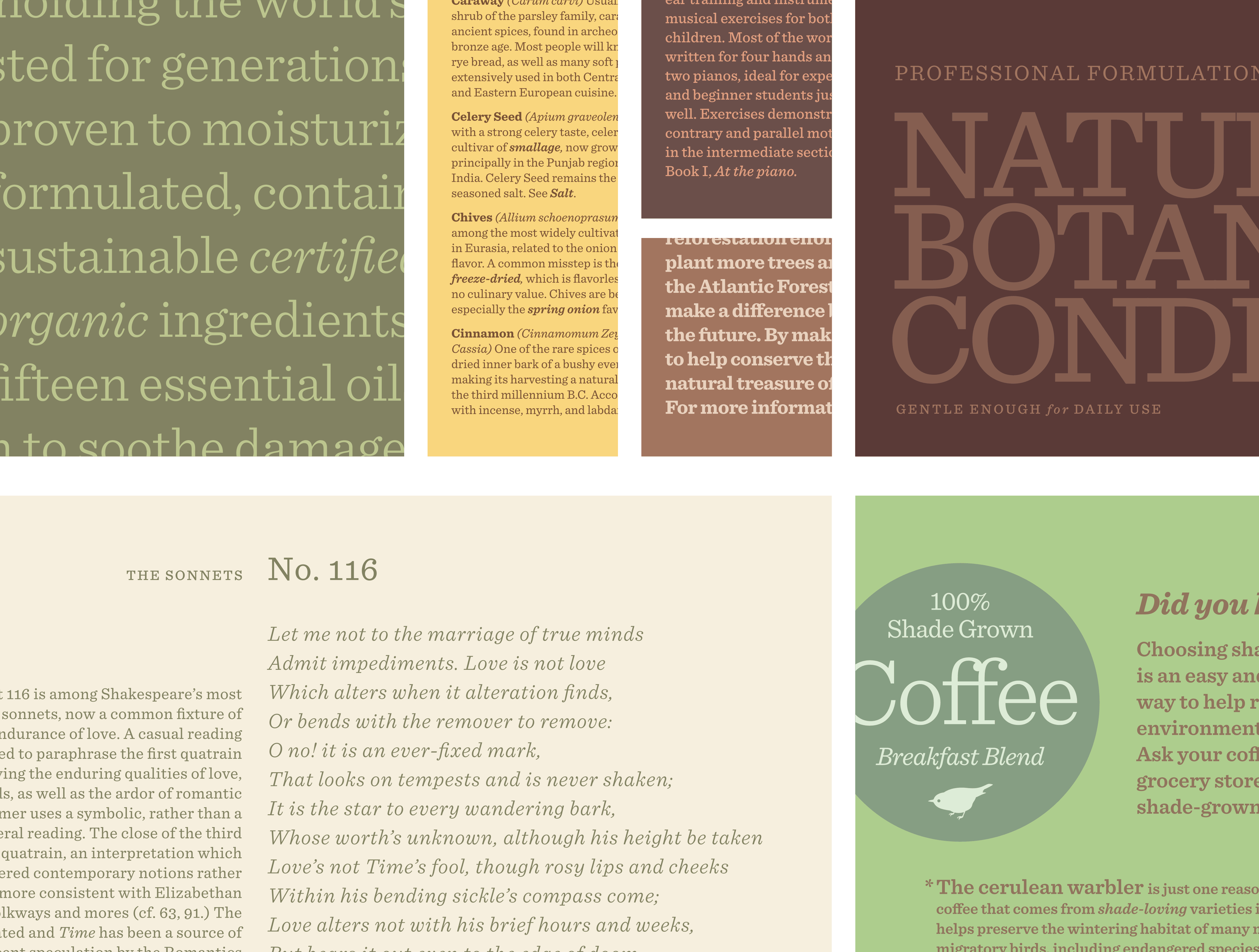
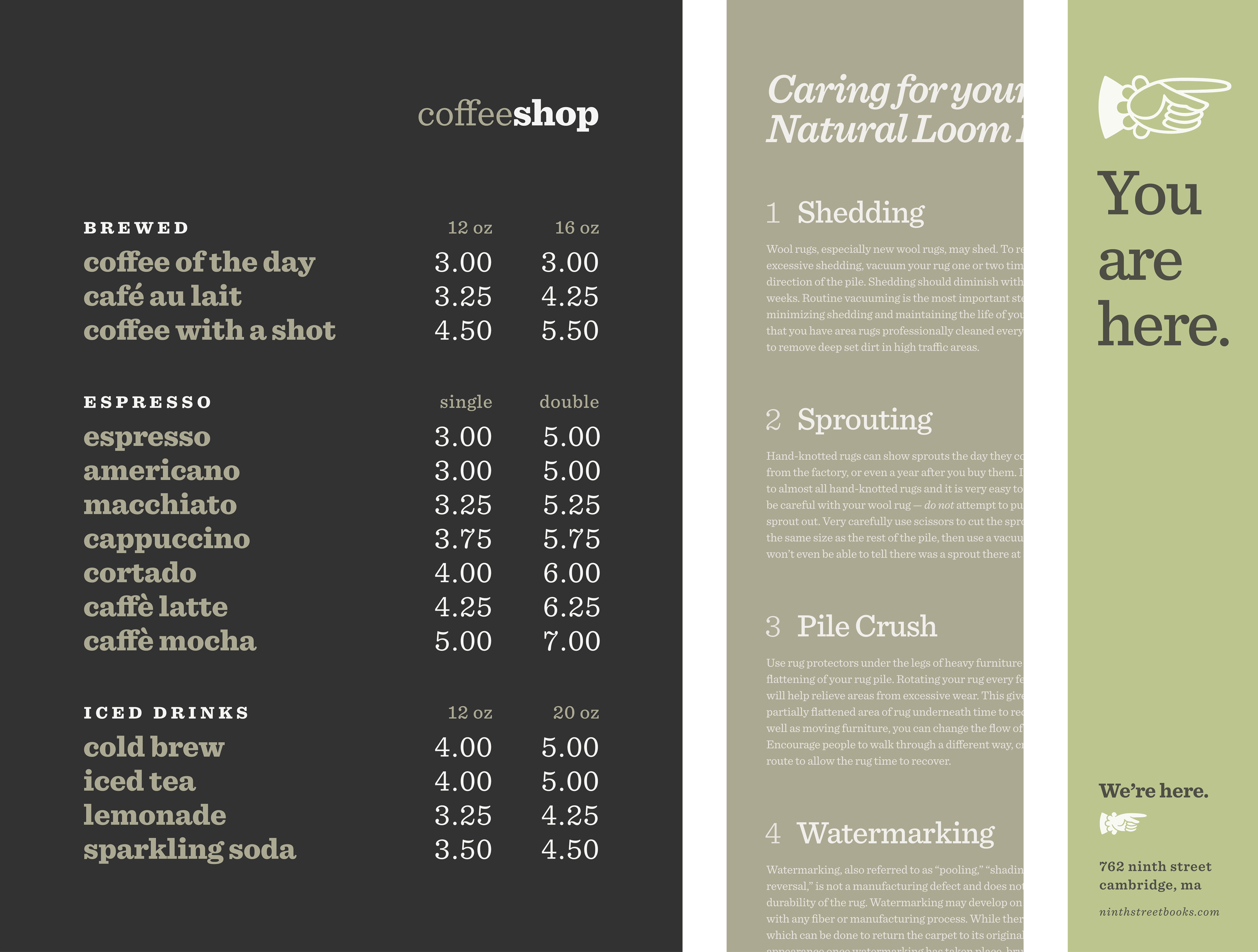
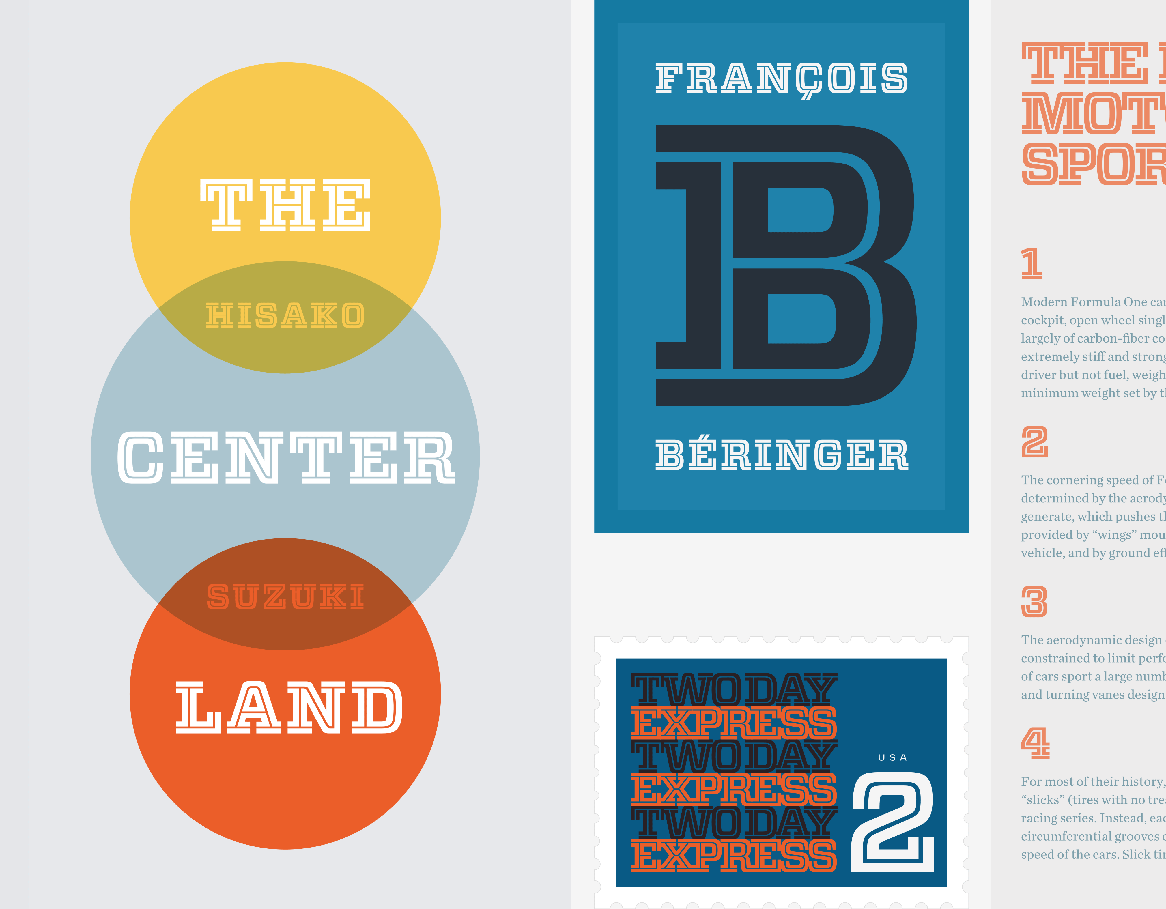
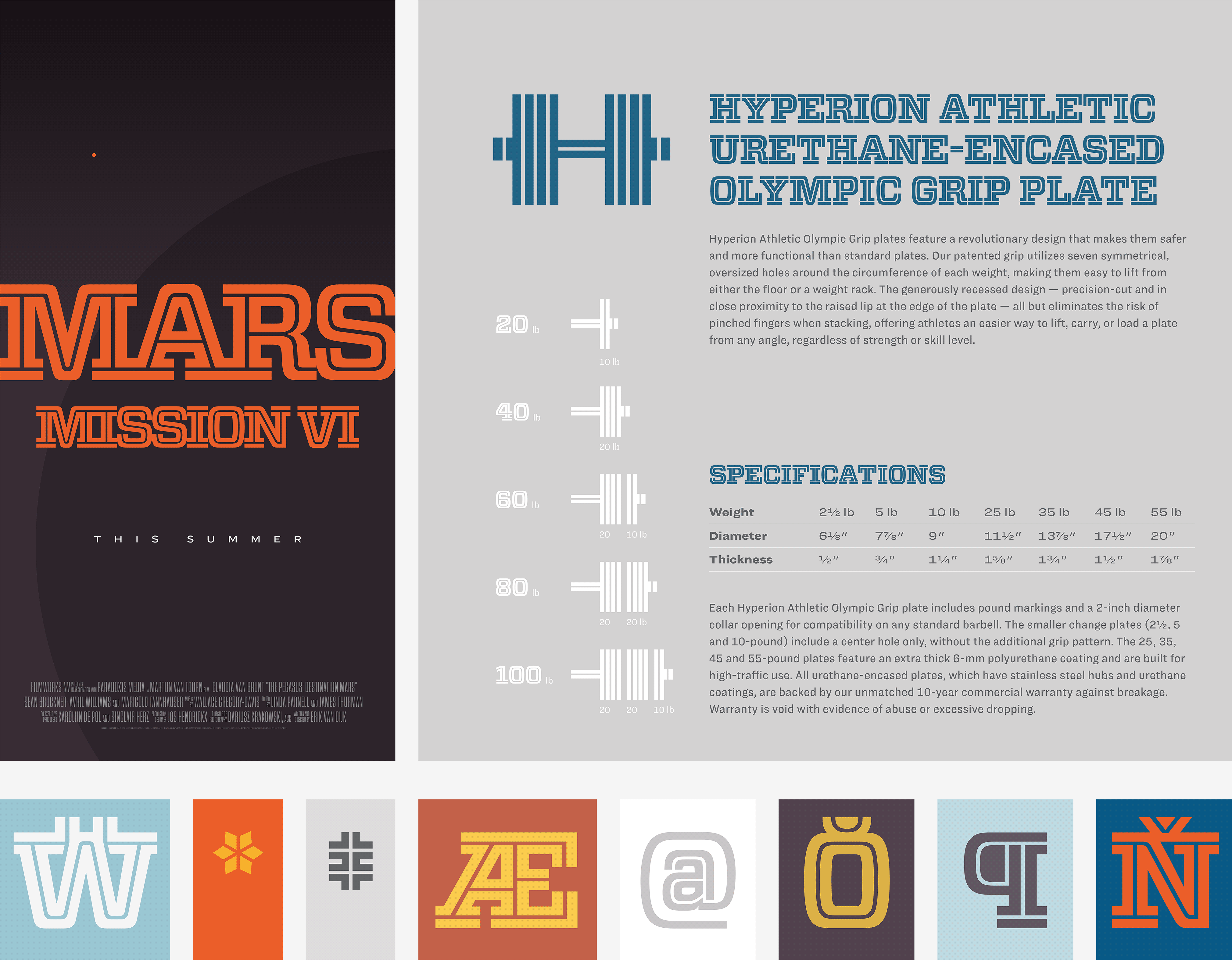
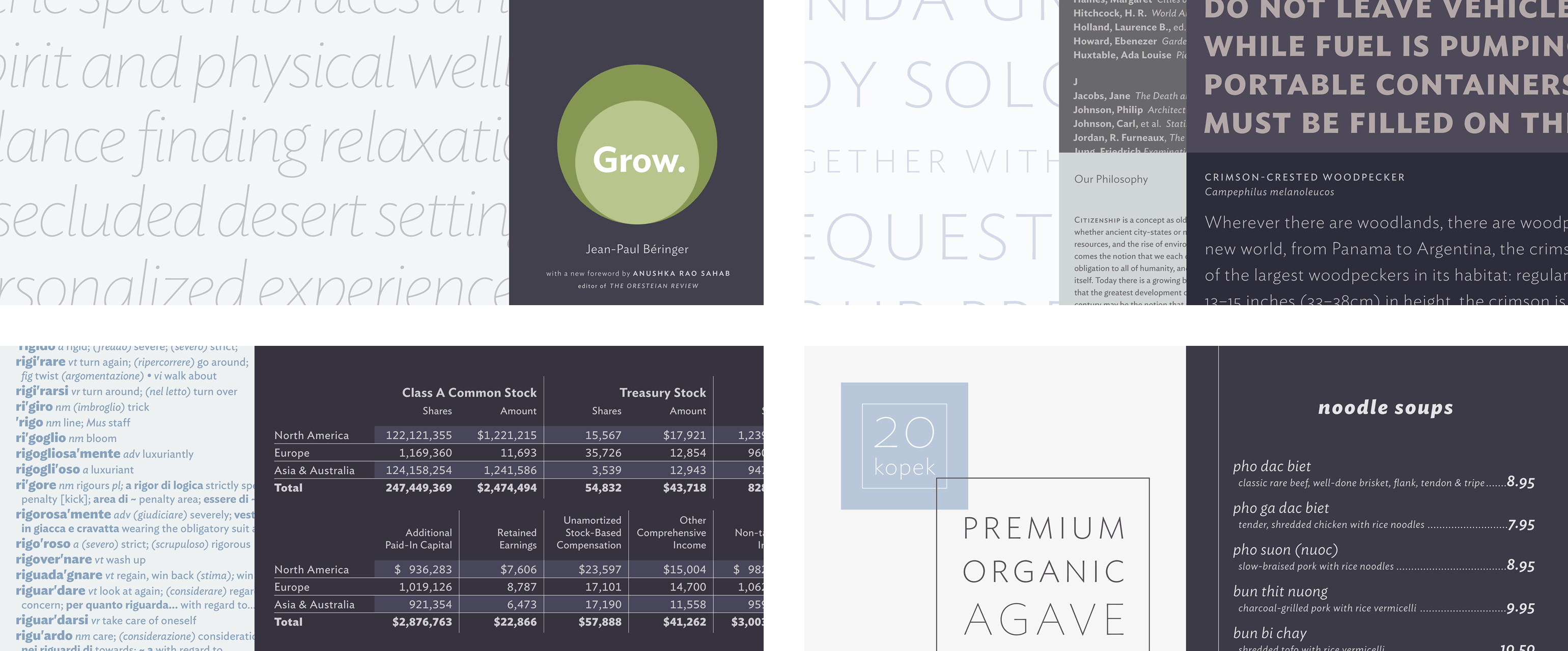
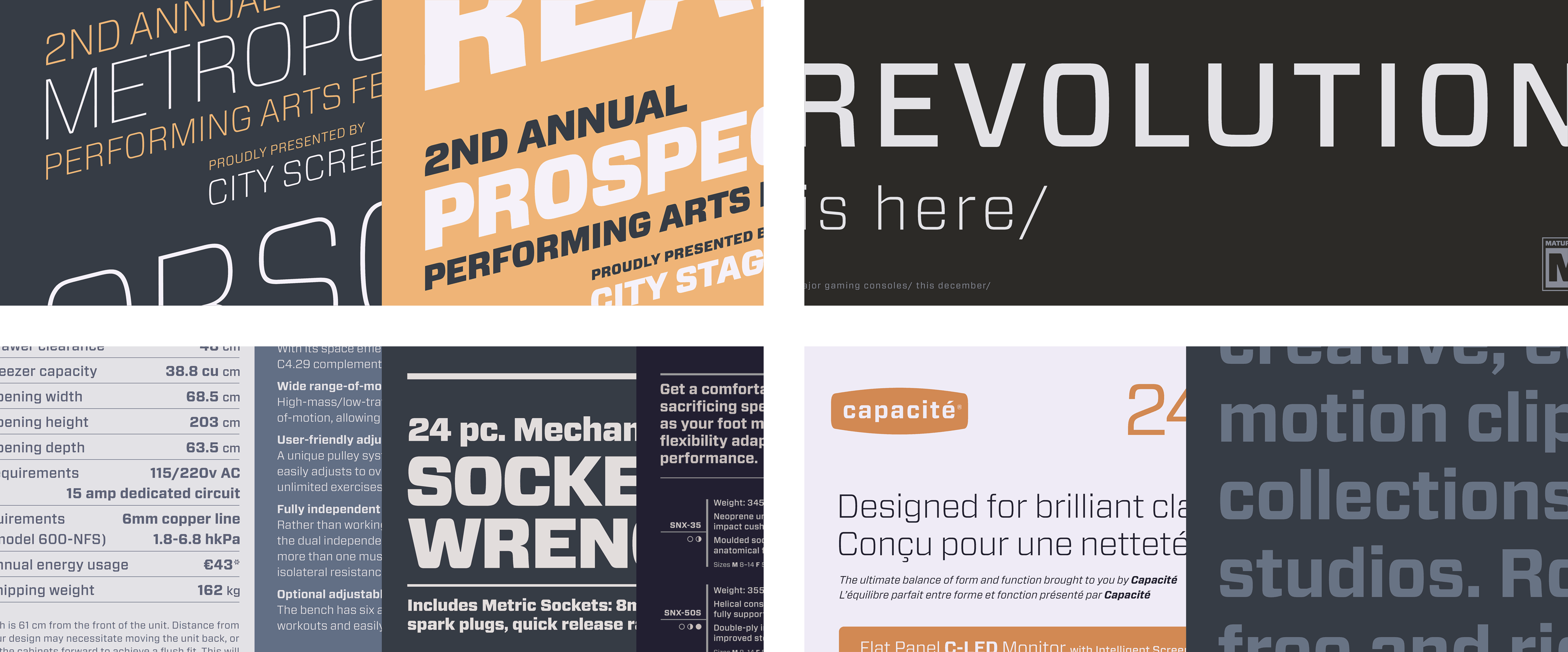
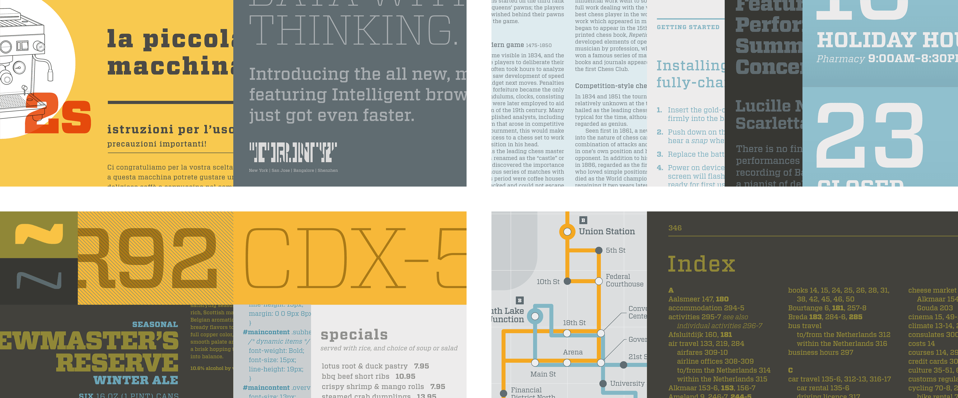
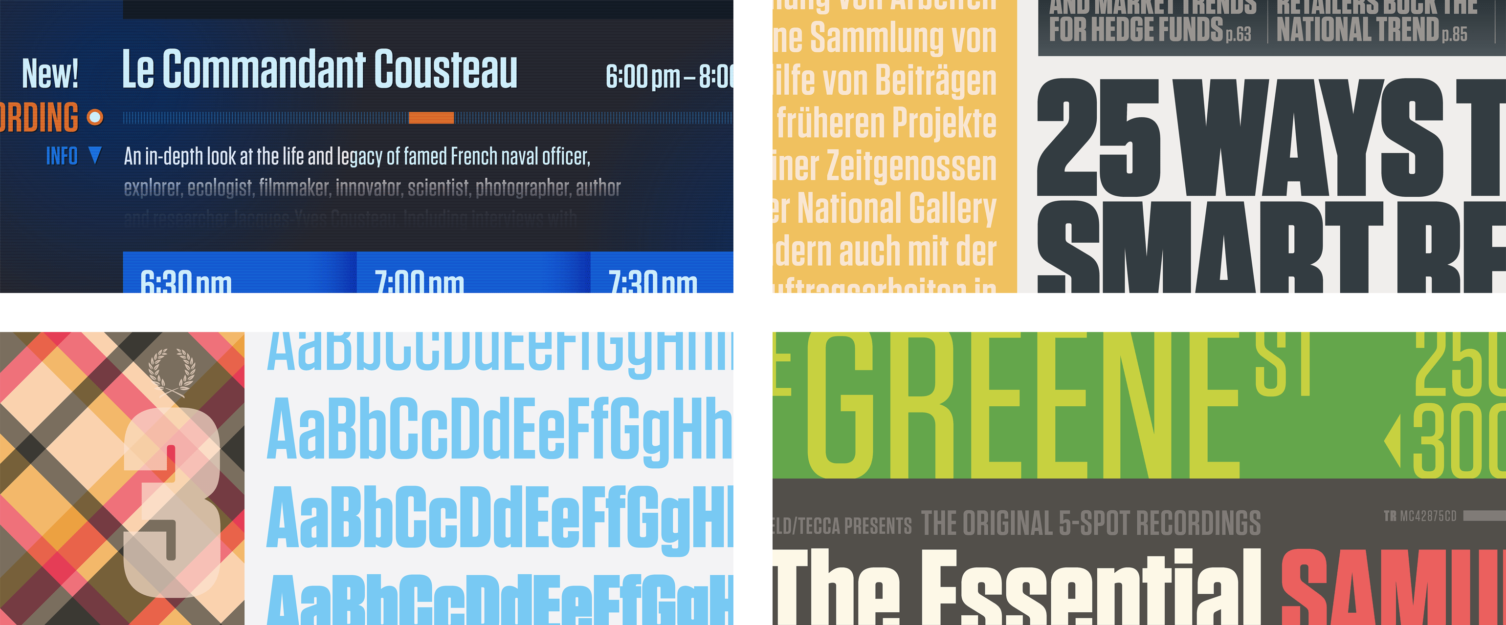
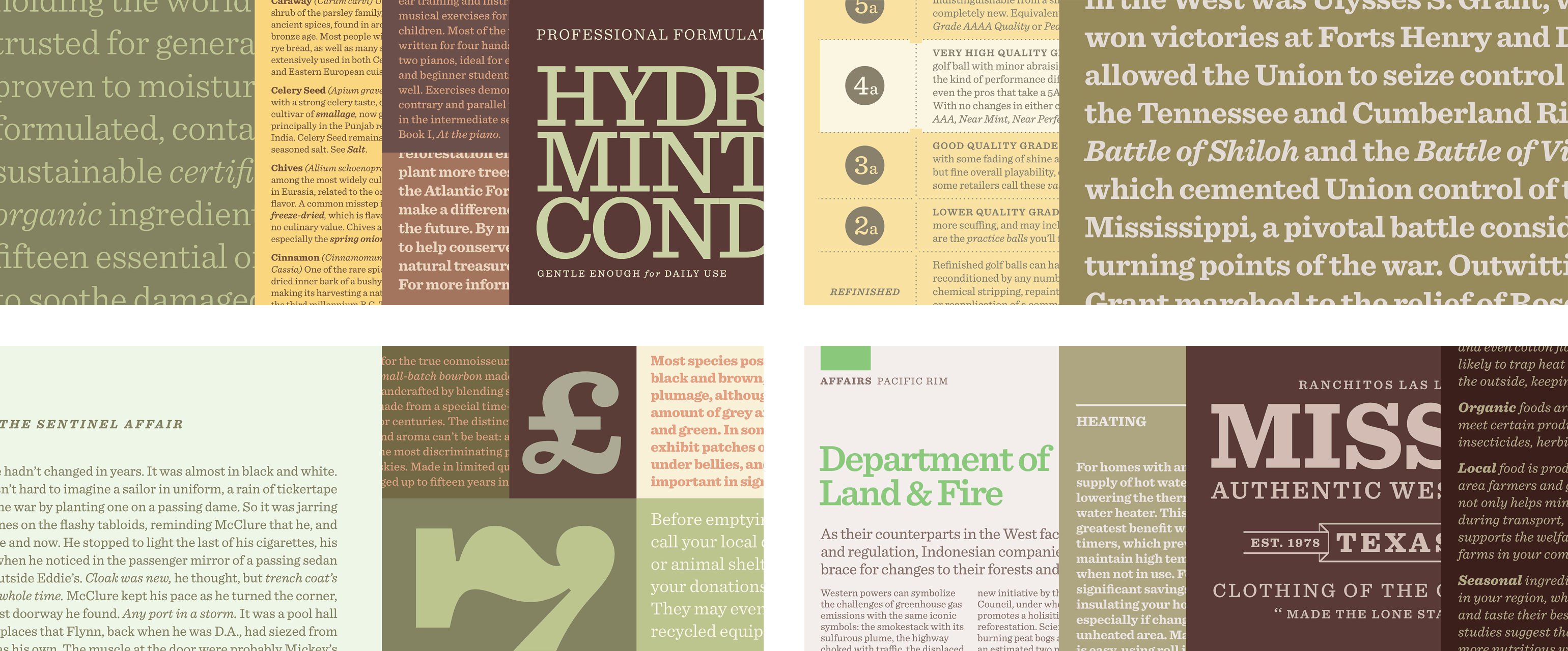
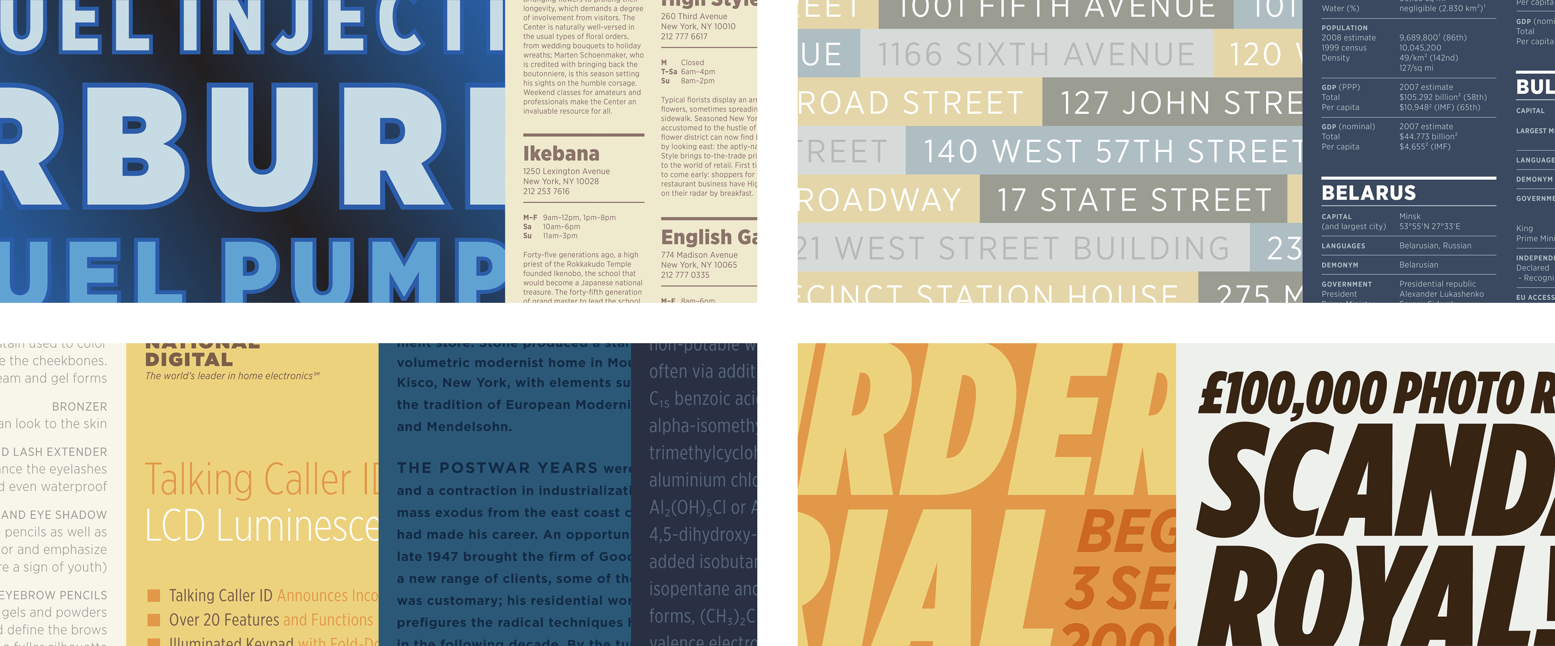
Aspirational imagery designed to inspire.
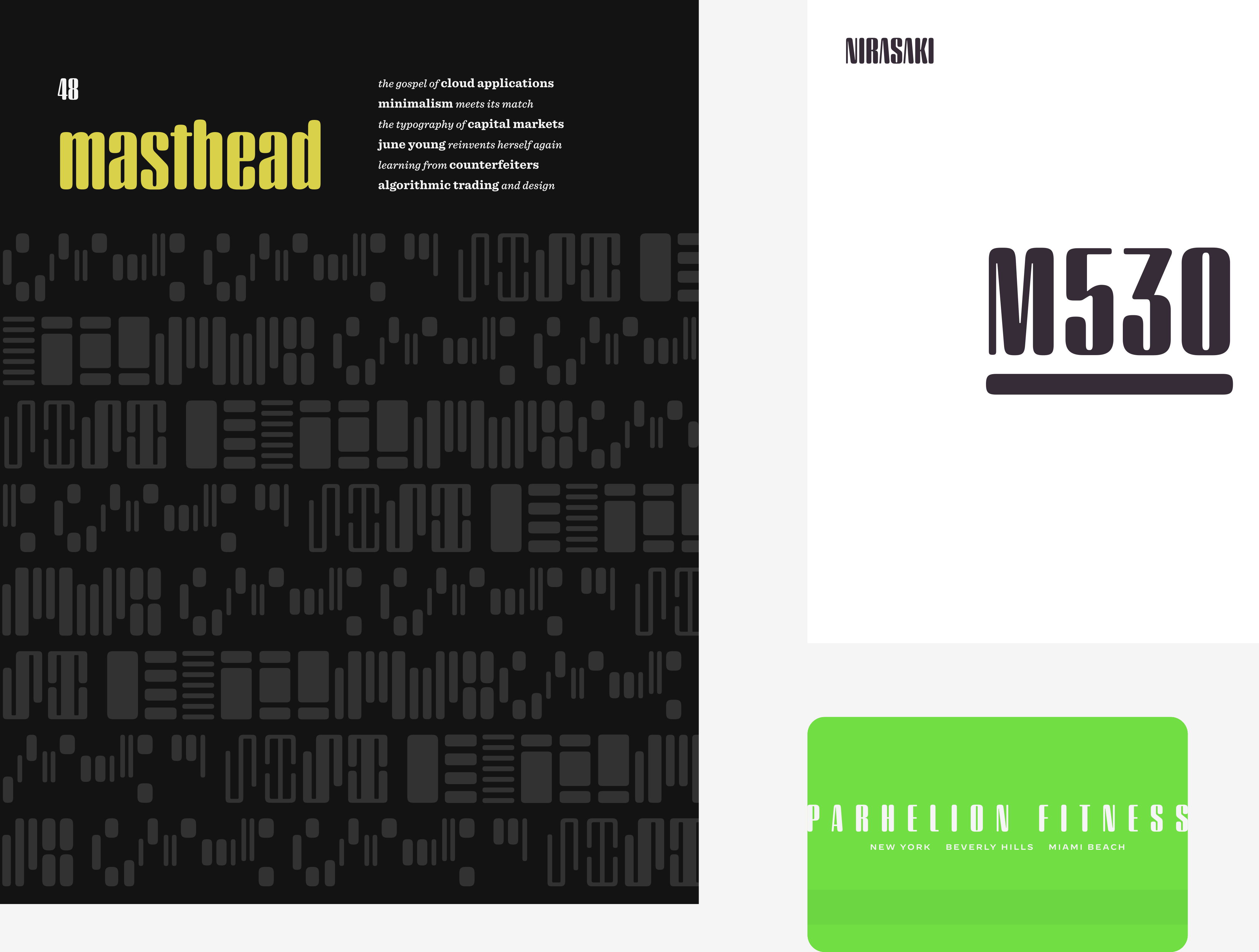
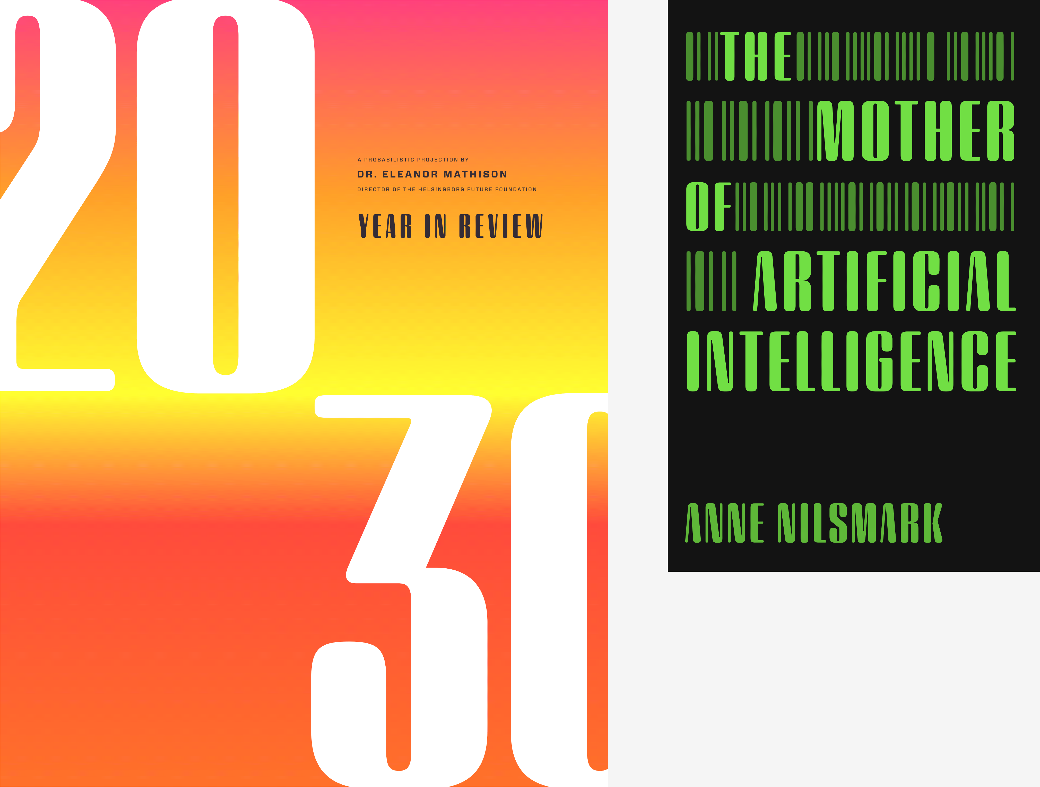
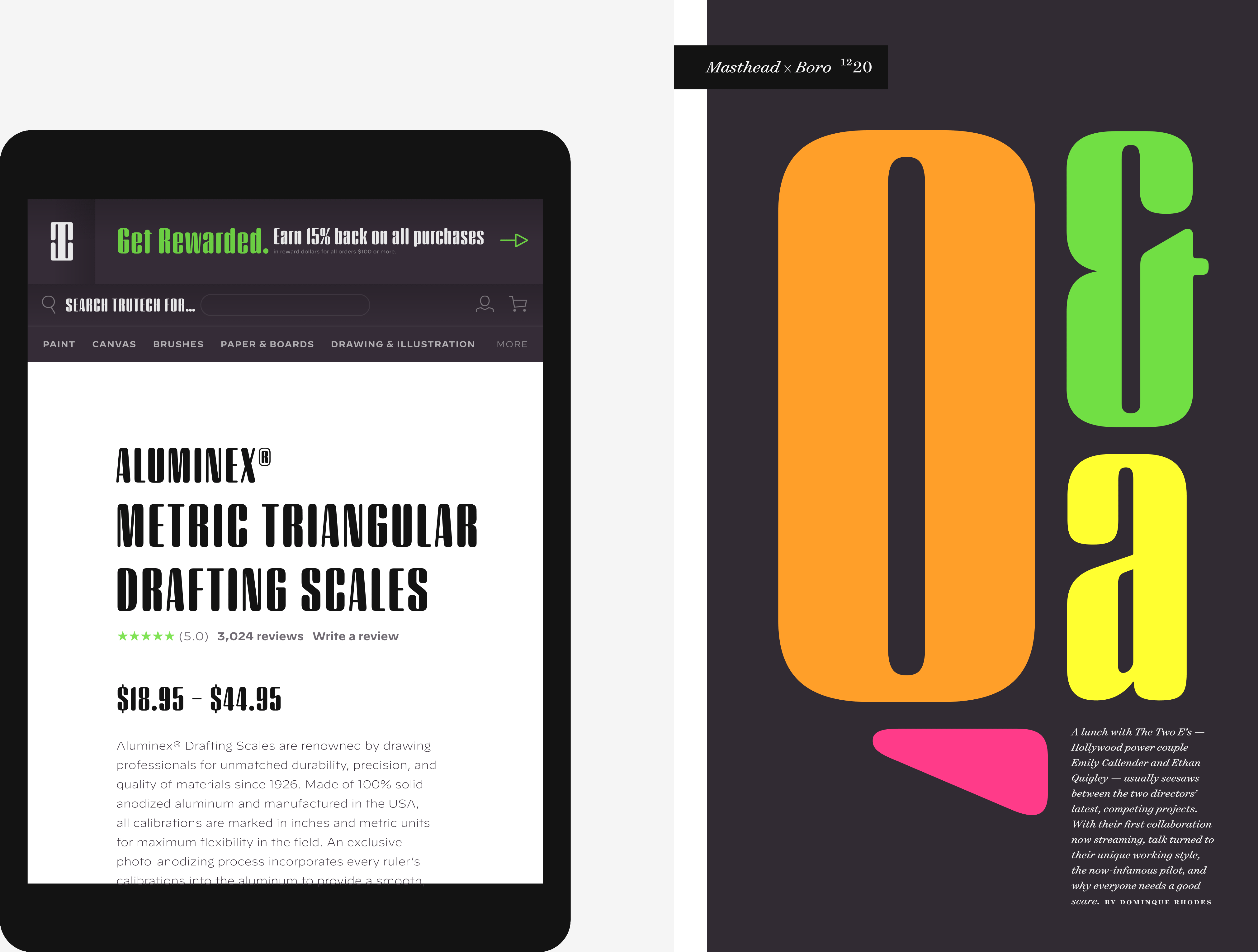
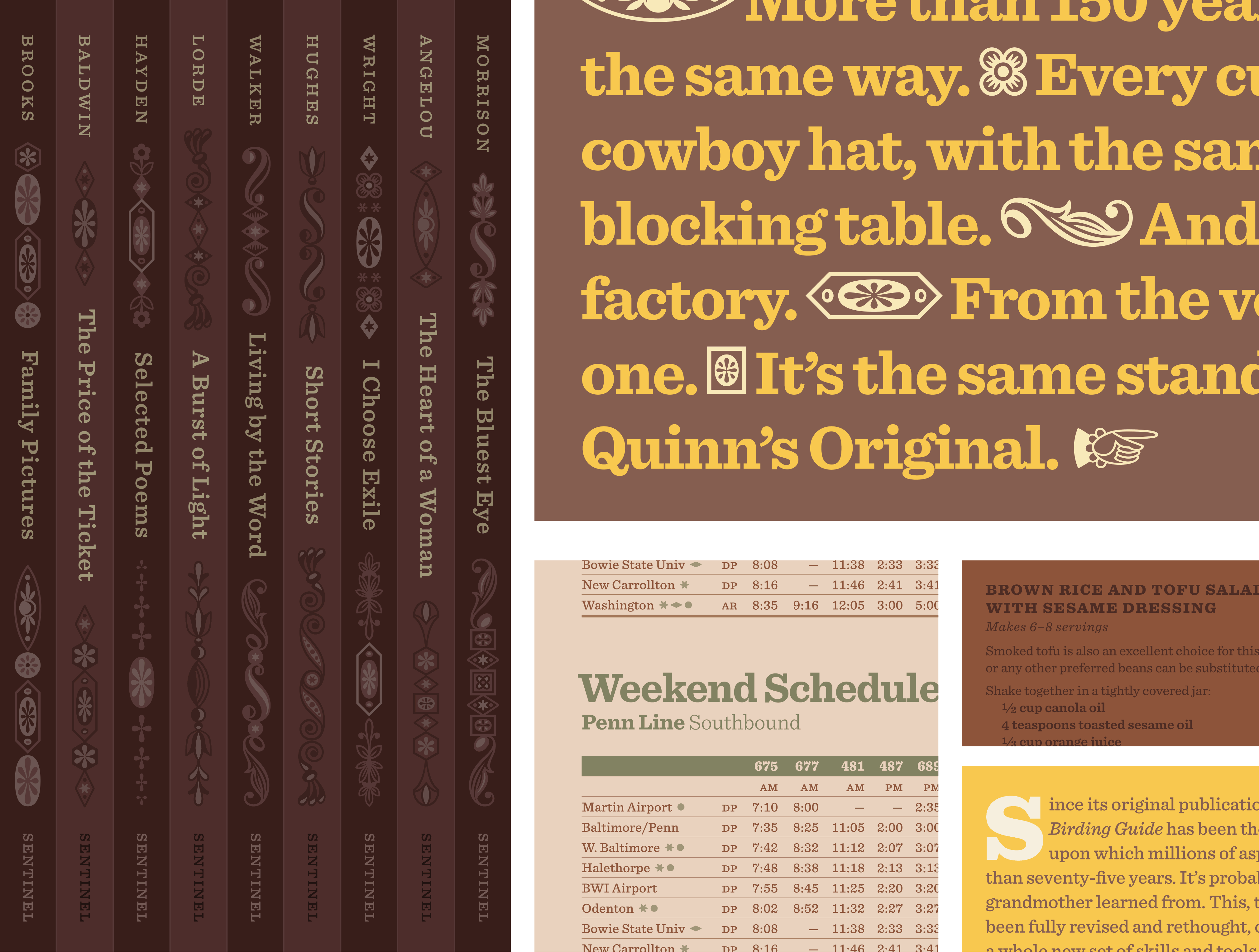
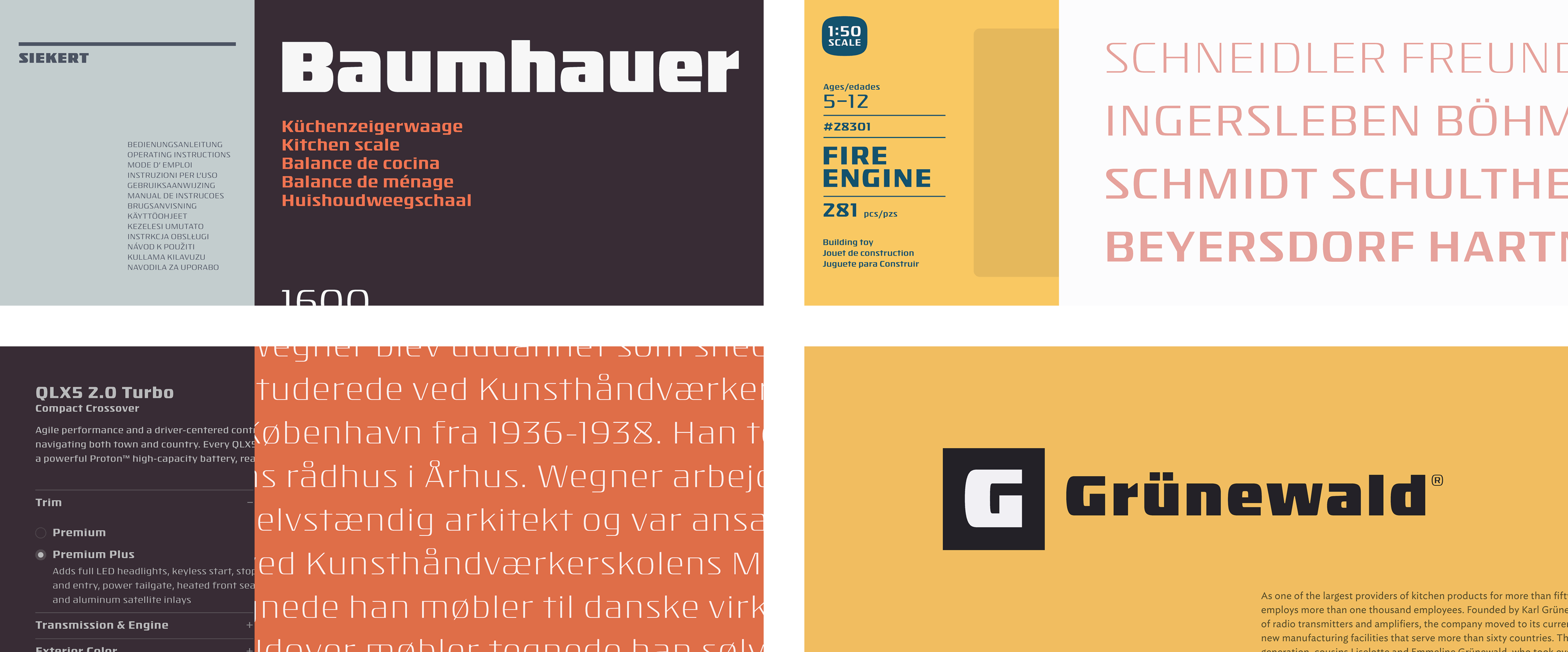
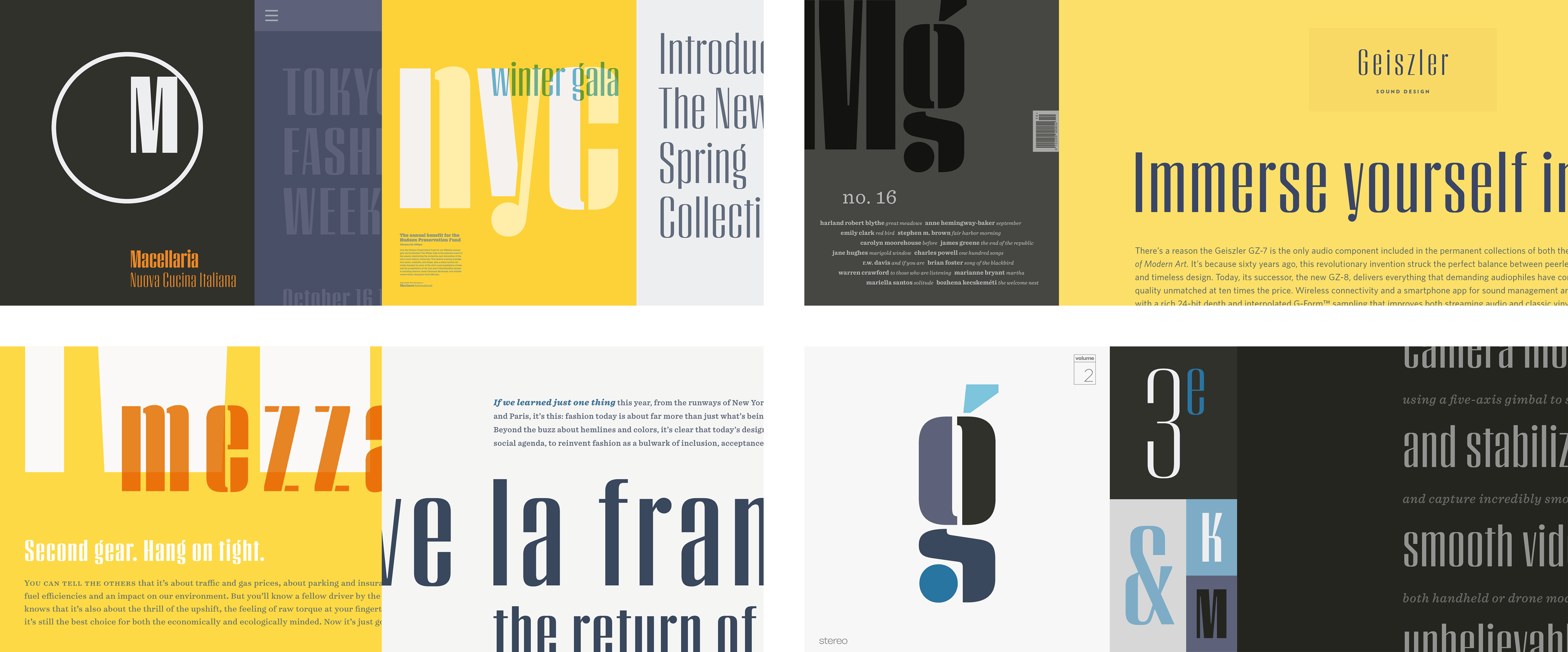
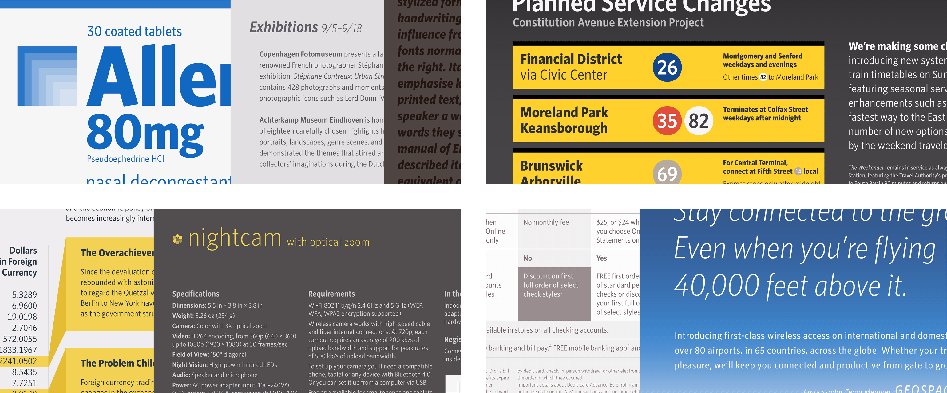
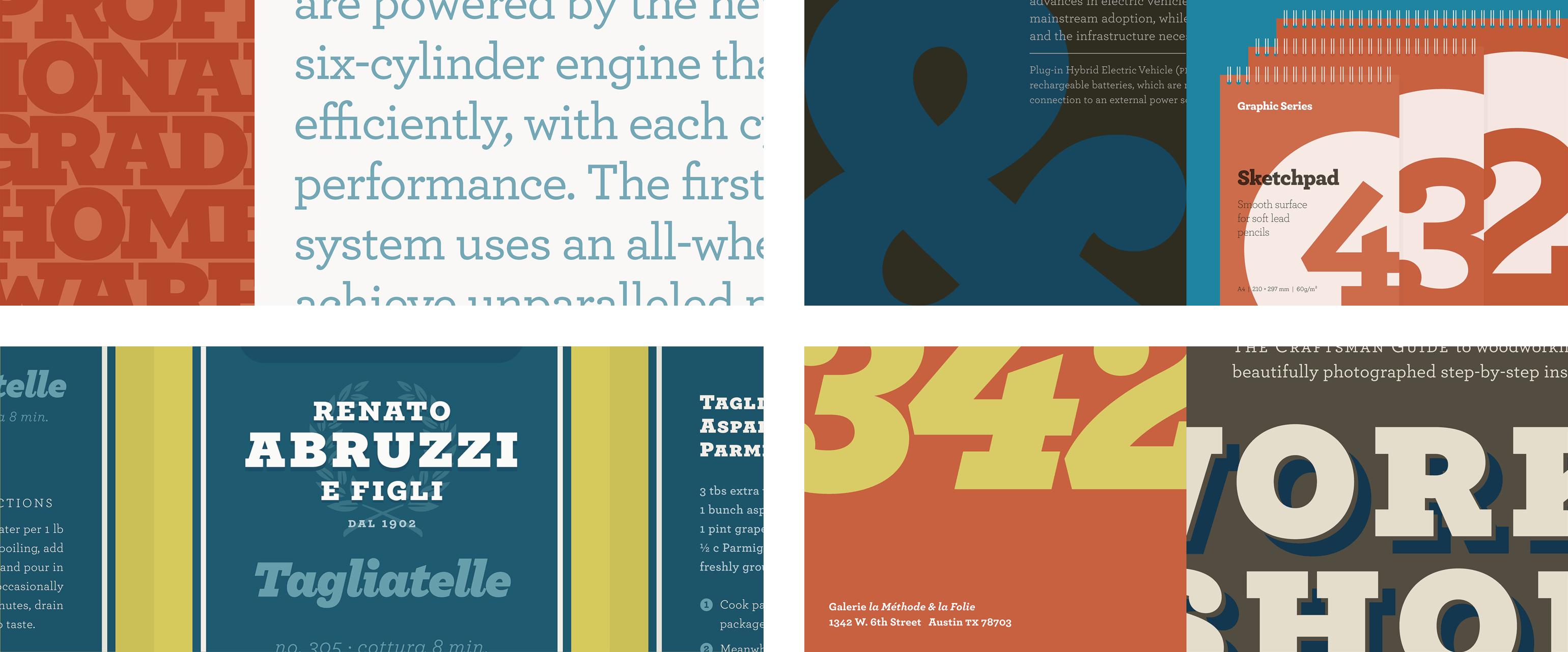
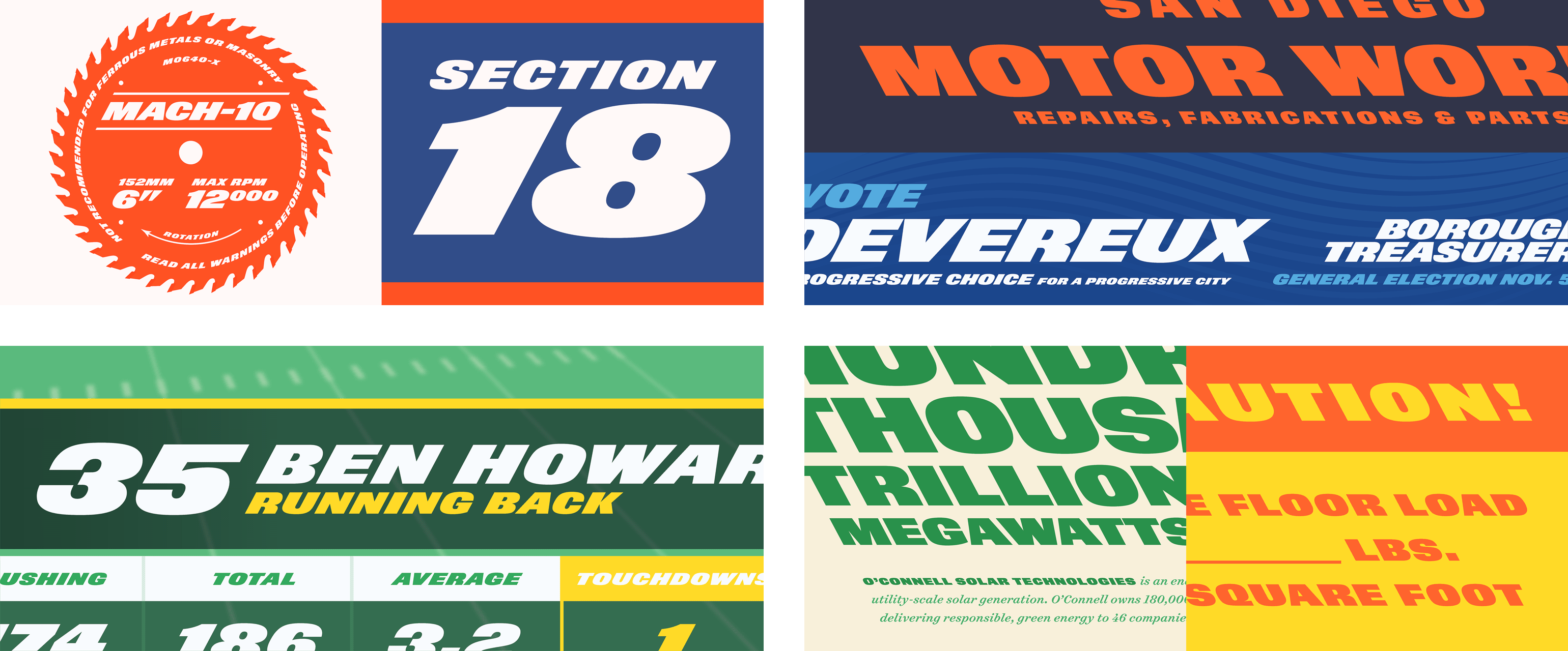
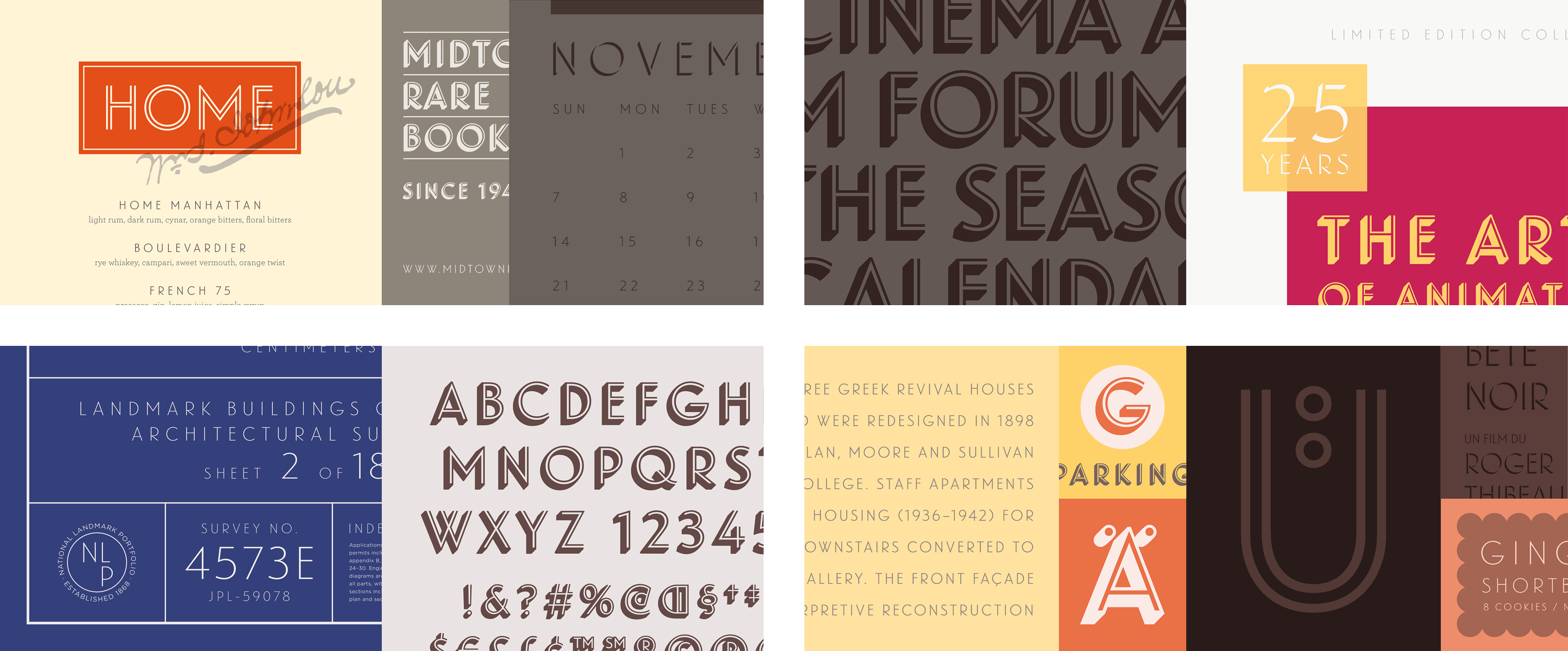
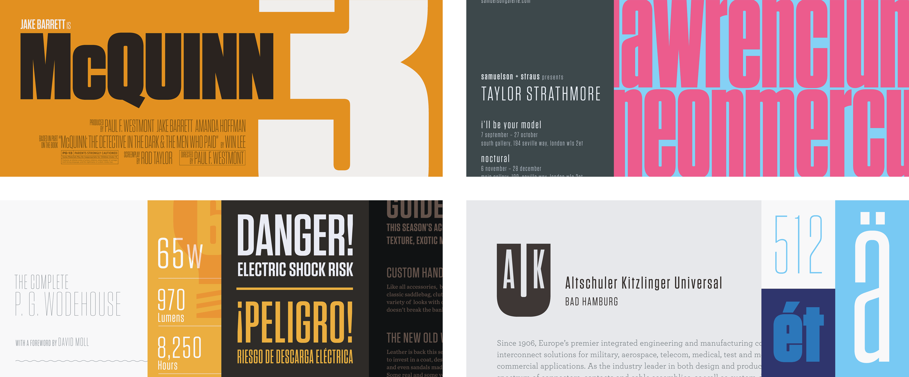
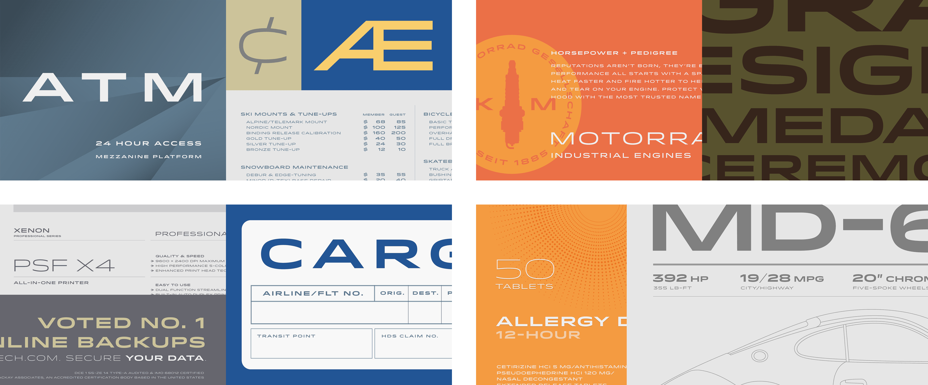
As designer at Hoefler&Co, I shared the responsibility of creating all of the sample art seen on (and off) the website with our founder, Jonathan Hoefler. Always a collaborative effort, nearly every piece of art was passed back and forth between us as we rearranged, recolored, or completely reimagined them. While this page shows just a small sample of the imagery we designed for typography.com, I’ve attempted to represent the typefaces and work that most accurately reflect my own ideas, aesthetic, and artistic contributions to the H&Co legacy.
“Most graphic designers choose the fonts that best fit their projects. Brian Hennings does the opposite: he chooses the projects that best fit the fonts.”
Jonathan Hoefler


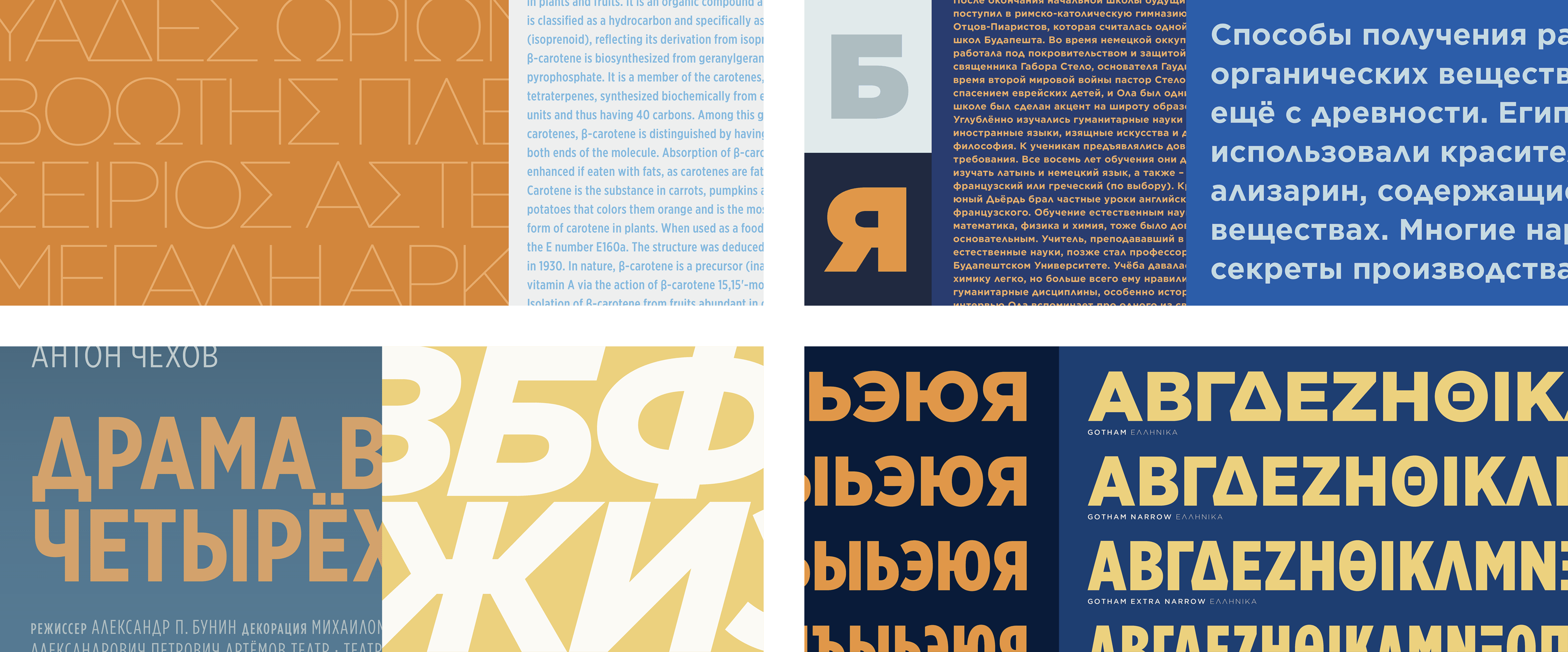
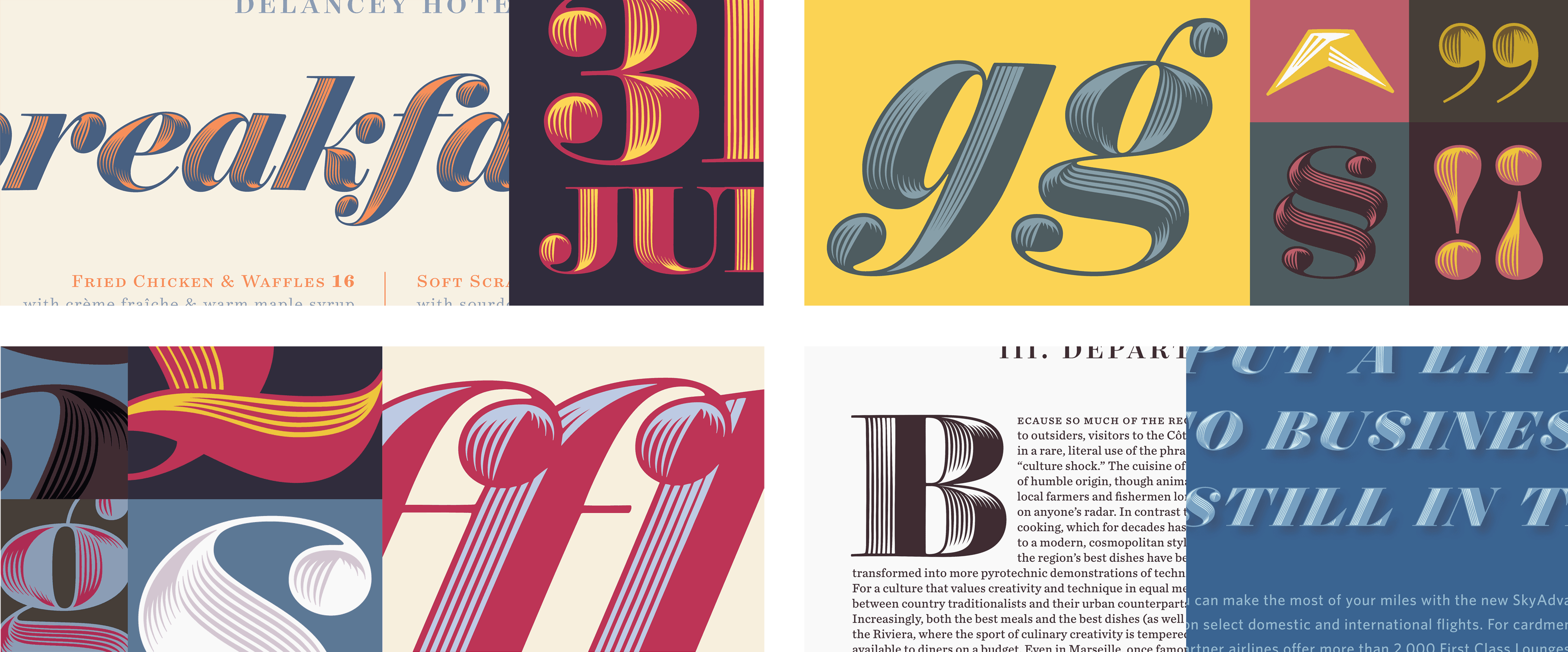
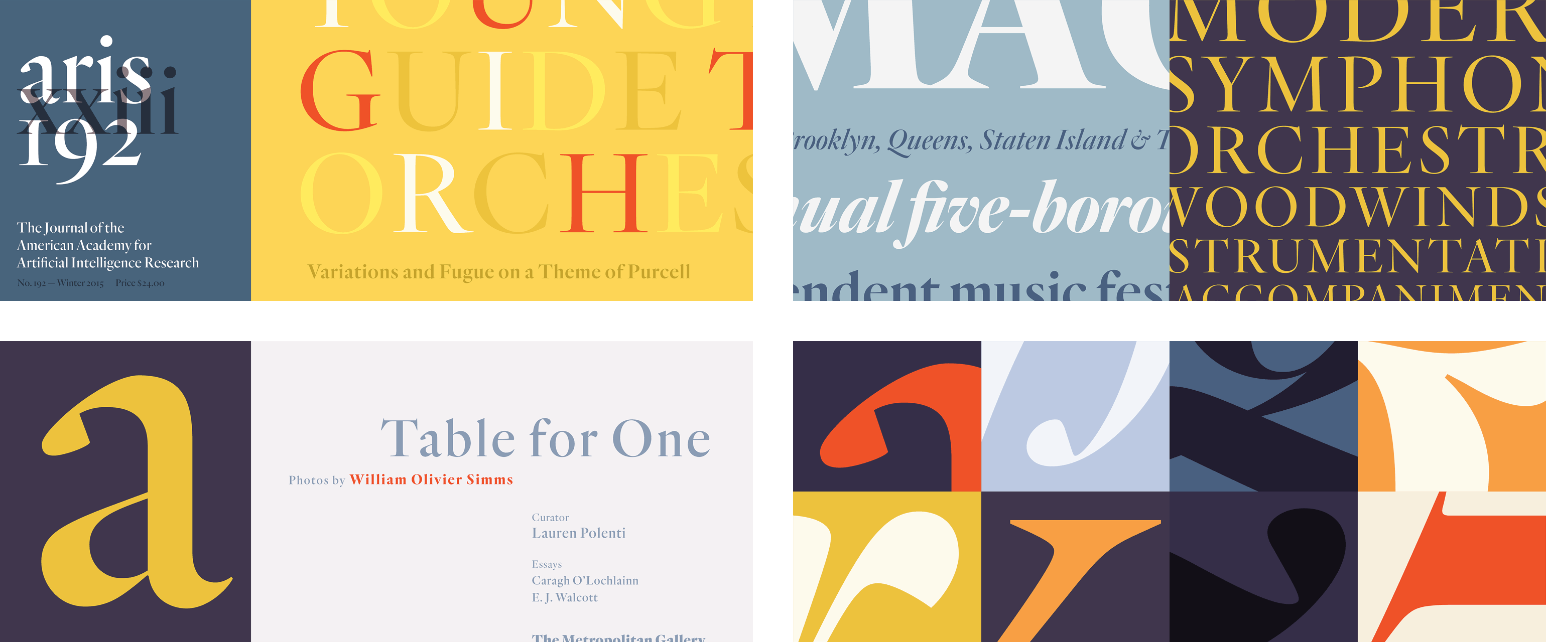
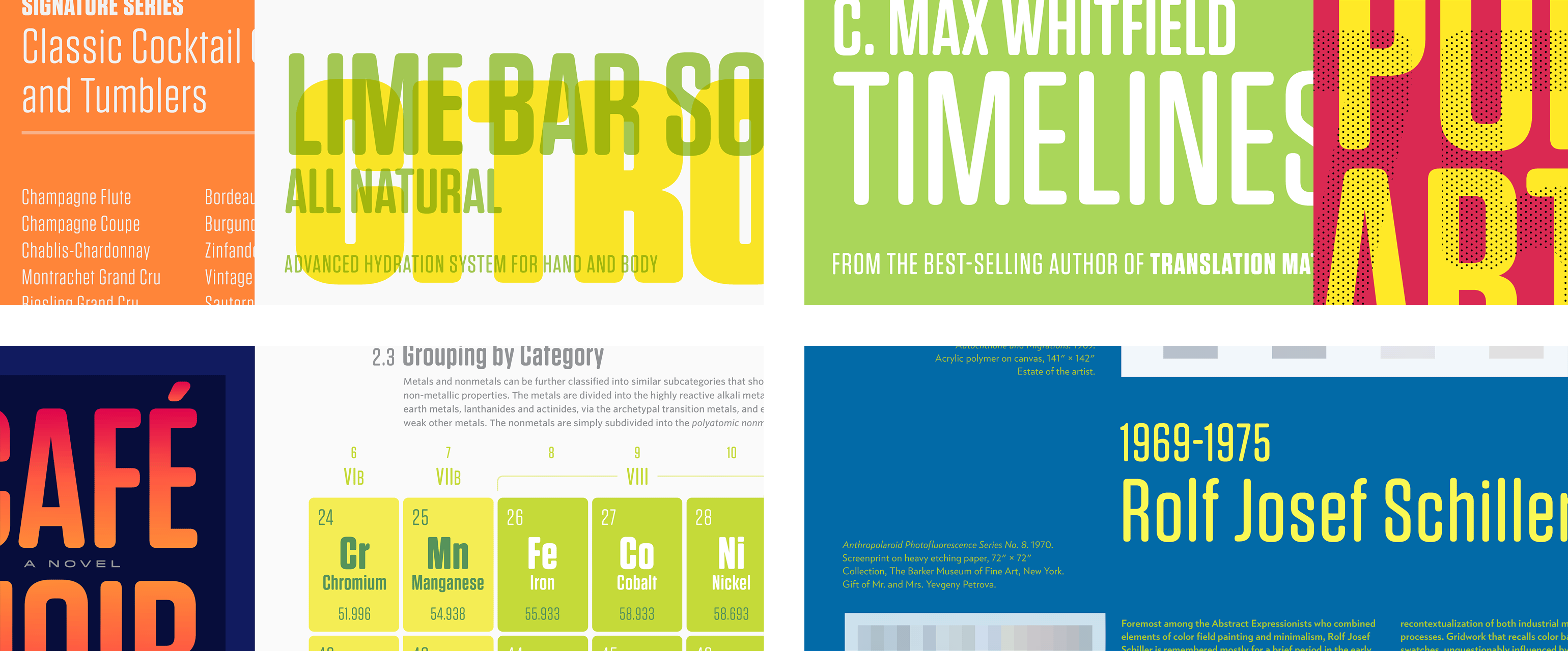
Released with the new typography.com, we built a new section called Design Notes to present the story and inspirational artwork for each type family. The format of this section, which shares its structure with blog articles, made it possible to present more artwork alongside each story. This artwork includes type specimens, inspiration material, and anything else that helps illustrate the thought behind the fonts. This new section also gave us a much larger, grander canvas we could use to display the imagery, which was constrained on the old site to just 750 × 300 pixels. Additionally, a bigger canvas let us showcase type at large sizes, and made it easier to present type in a vertical aspect ratio without worrying about it being displayed too small or tightly cropped.
The free, open space of Discover.typography themes, where all sizes of objects lived artfully arranged side by side, with as much or as little white space and framing as desired, is exactly what we wanted to do in the new Design Notes carousel design. Because we were no longer restrained to a fixed height, each release allowed us to create artwork that best suited the needs of the type — not the stage.
While the classic slideshows were an innovation in the world of typography, the Design Notes carousels provided a fresh and modern user experience, especially well-suited for complex artwork that benefitted from a little more time and closer inspection. This format also appealed to viewers who preferred quickly swiping through the artwork rather than watching a slideshow.*
Not only were the artwork stage and page layouts improved, but the art itself with Design Notes carousels could now be custom fit according to the device. This was especially important when it came to a subject matter like type, whose success depends so much on size, legibility, and context. Our solution was to build the carousel so that two completely different sets of images could be displayed: one set for large screens and another for small. As with all H&Co projects, our solution was rarely the easiest one. The end result was a beautiful, inspirational carousel designed for every font released after 2019. And it’s all thoughtfully presented to each viewer, whether they’re looking for their next typographic inspiration on a giant monitor, shopping for fonts on their tablet, or venturing down an internet wormhole (to a wonderful part of it!) on their phone.
* The irony of displaying carousel images as a slideshow here is not lost. Get in touch and I’d be happy to explain myself.
