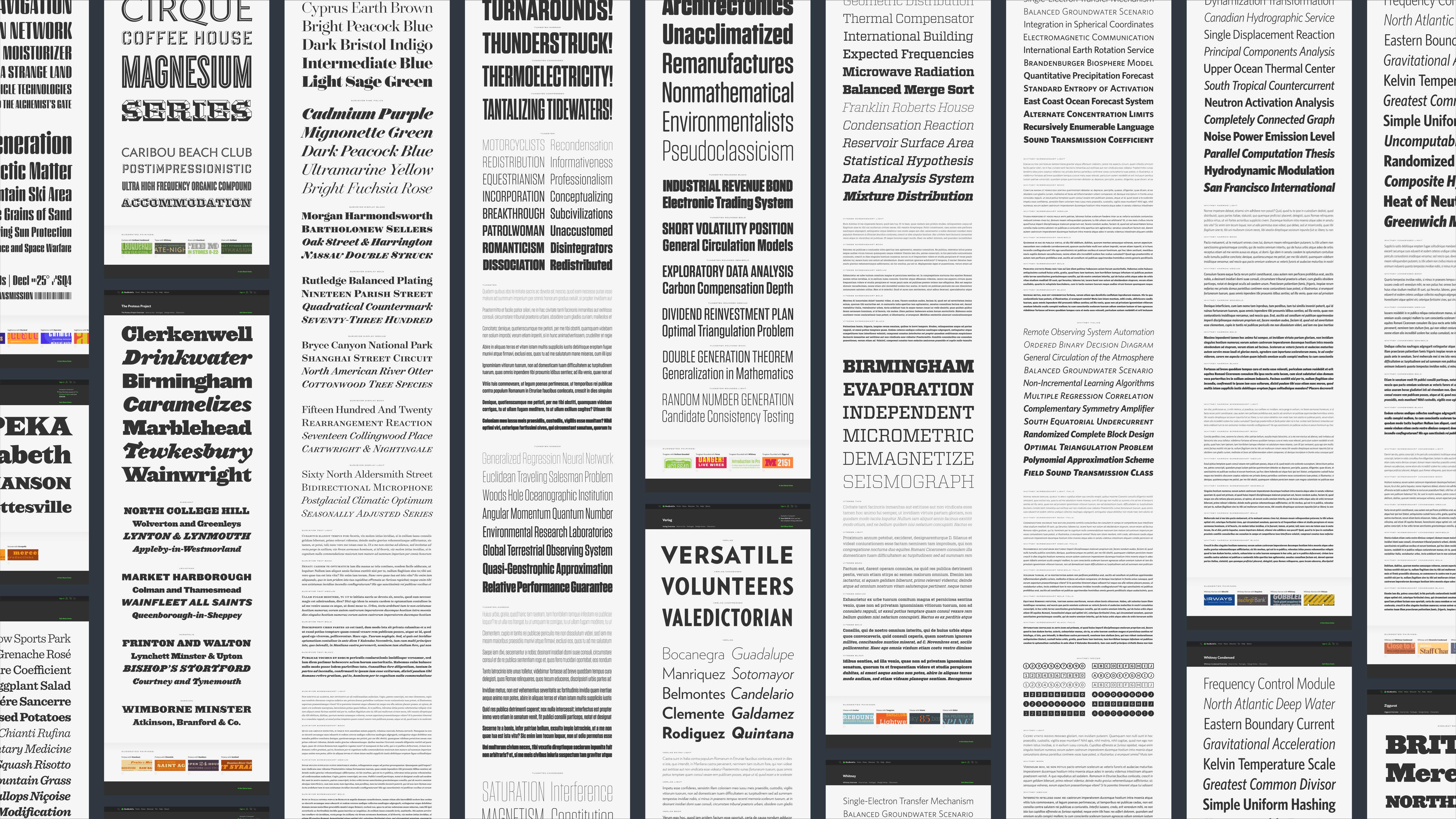
H&Co Specimens
Any screen. Any size. Any device. Every. Single. Font.
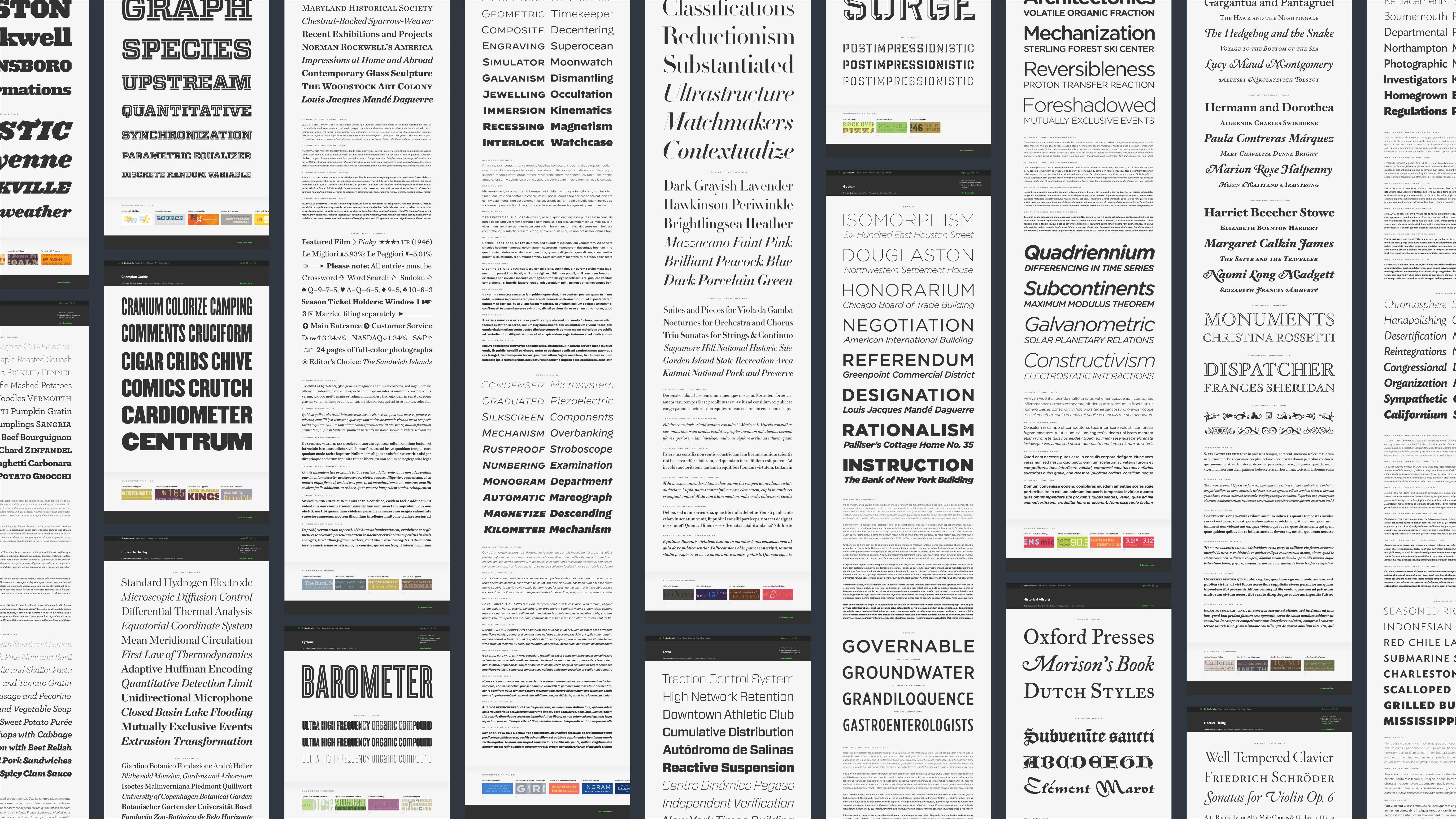
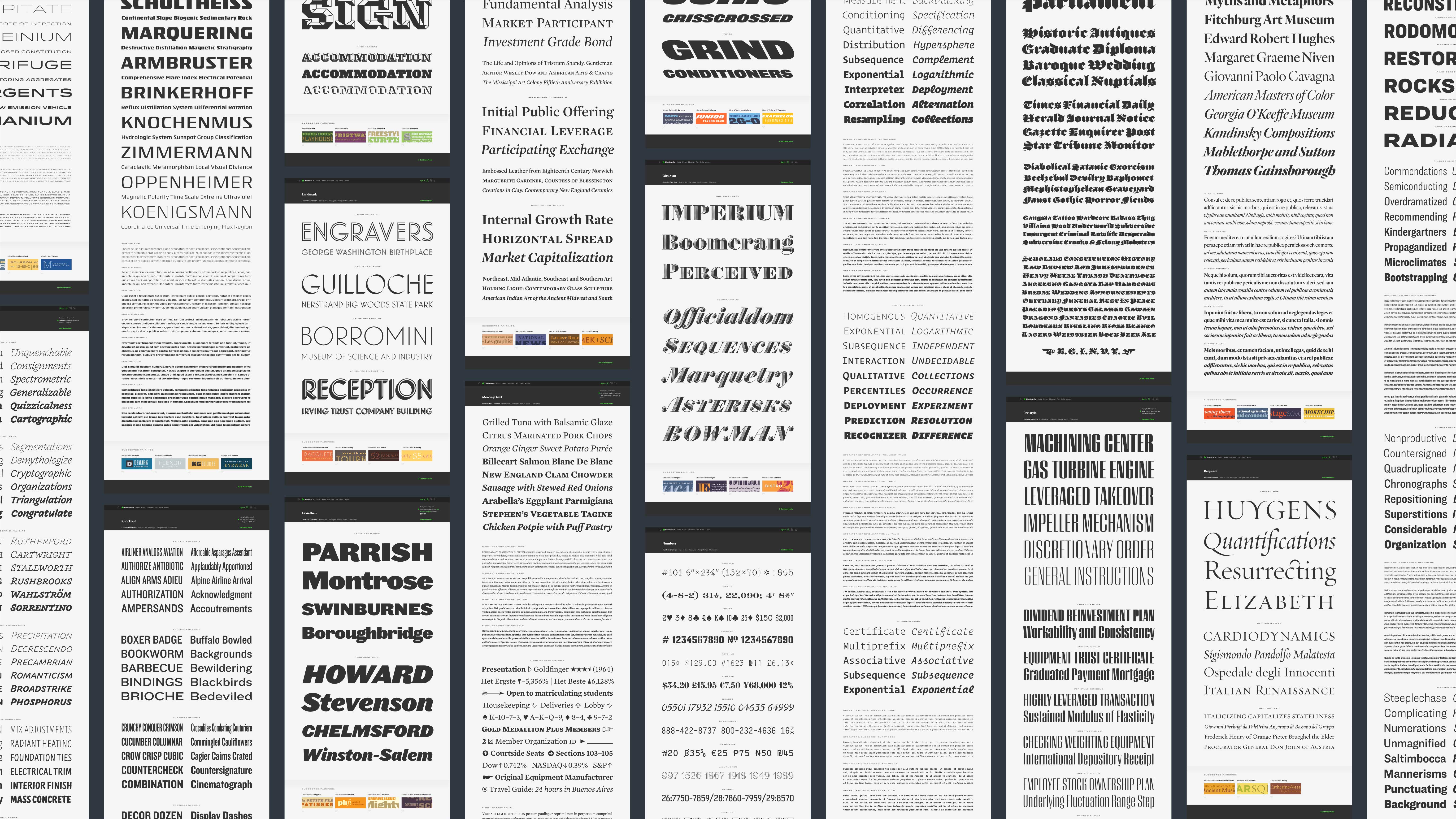
Overviews are the first impression for every family in the H&Co library. Custom designed and written, the overview specimens show off every typeface in its best light. A scroll through reveals every style, providing an immediate look at the range of the family, as well as an idea of the range of sizes where the fonts look their best. As with everything on the redesigned website, separate specimens were written and designed for desktop and mobile views, ensuring the type was presented at an appropriate size, perfectly scaled for the screen, at any size, in every browser, on all devices.


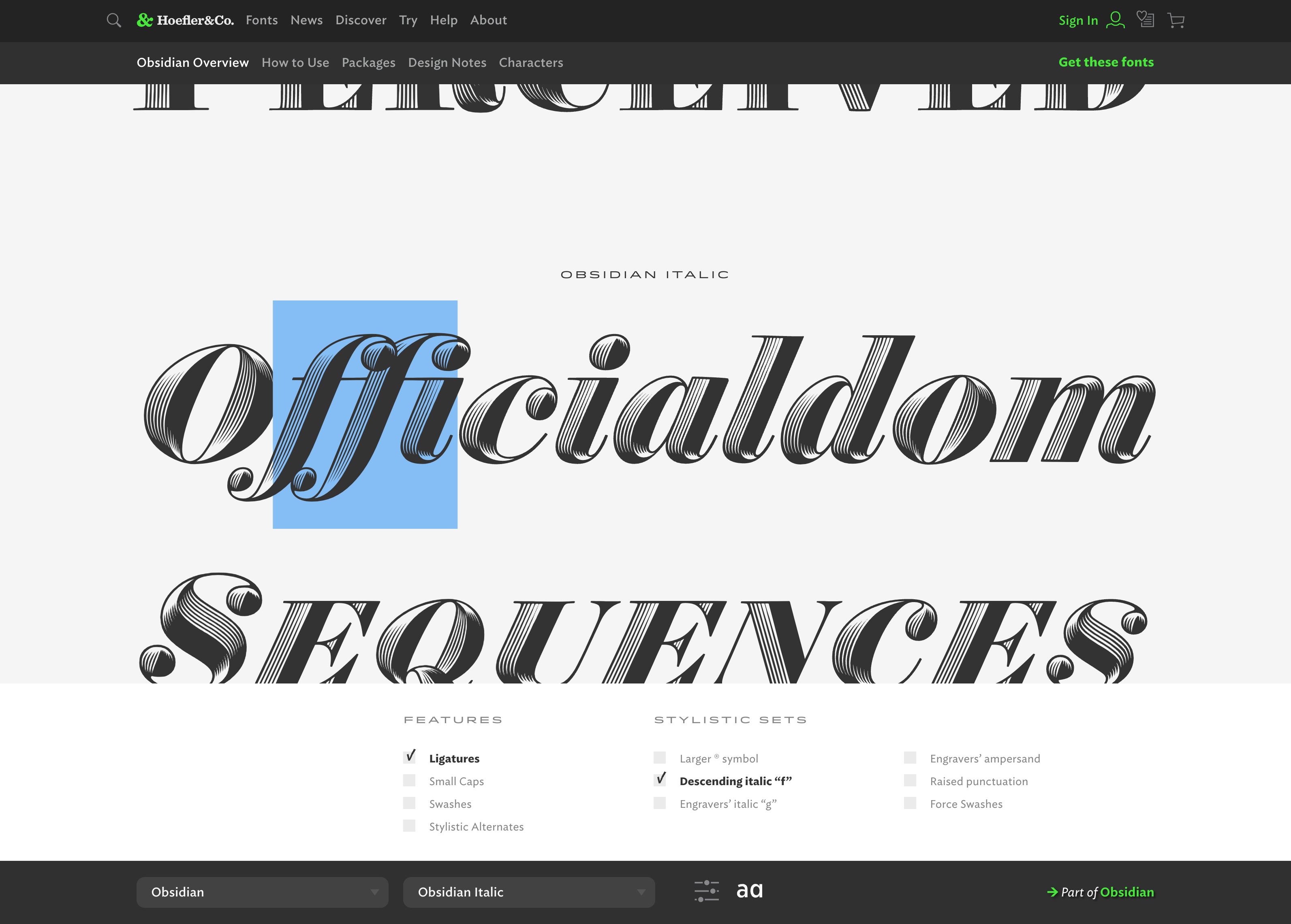
Building beautiful type specimens was step one. Next, I worked with our extraordinarily talented dev team to make each overview fully interactive so that customers could edit the text and test drive the fonts right there on the page. As luck would have it, I’d already helped design and build a tool to do just that. Released in 2016, Try.typography gave visitors a sample sentence and invited them to begin typing. All the UI was there to change and add fonts, as well as edit the layout with familiar type setting controls such as size, leading, tracking, and paragraph alignment. Because all H&Co typefaces are fully functional as web fonts, I was also able to utilize OpenType Features and Stylistic Sets, making this tool the perfect jumping off point for the new Overview UI.
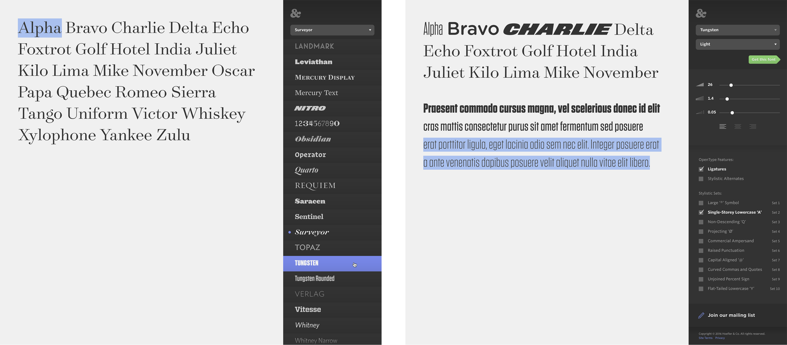
I helped custom design and build all of these interactive, editable type specimens using the exact same tool that would be available to the public. Our version simply allowed us to save and load layouts as needed. We hoped to some day release a Save and Share feature to customers, as it would be so convenient and helpful in the creative workflow to save your own self-made specimens and mockups for sharing with others on your team, your students, your classmates, or simply your own future reference.
In order to accommodate the Overview specimens, we redesigned the Try.typography UI by moving the controls from the sidebar to the bottom of the screen. This reserved the maximum possible space for displaying the interactive specimens, and also gave us an opportunity to offer simplified views of the controls while keeping all of the expected functionality and more (hello, space after paragraph) intact.
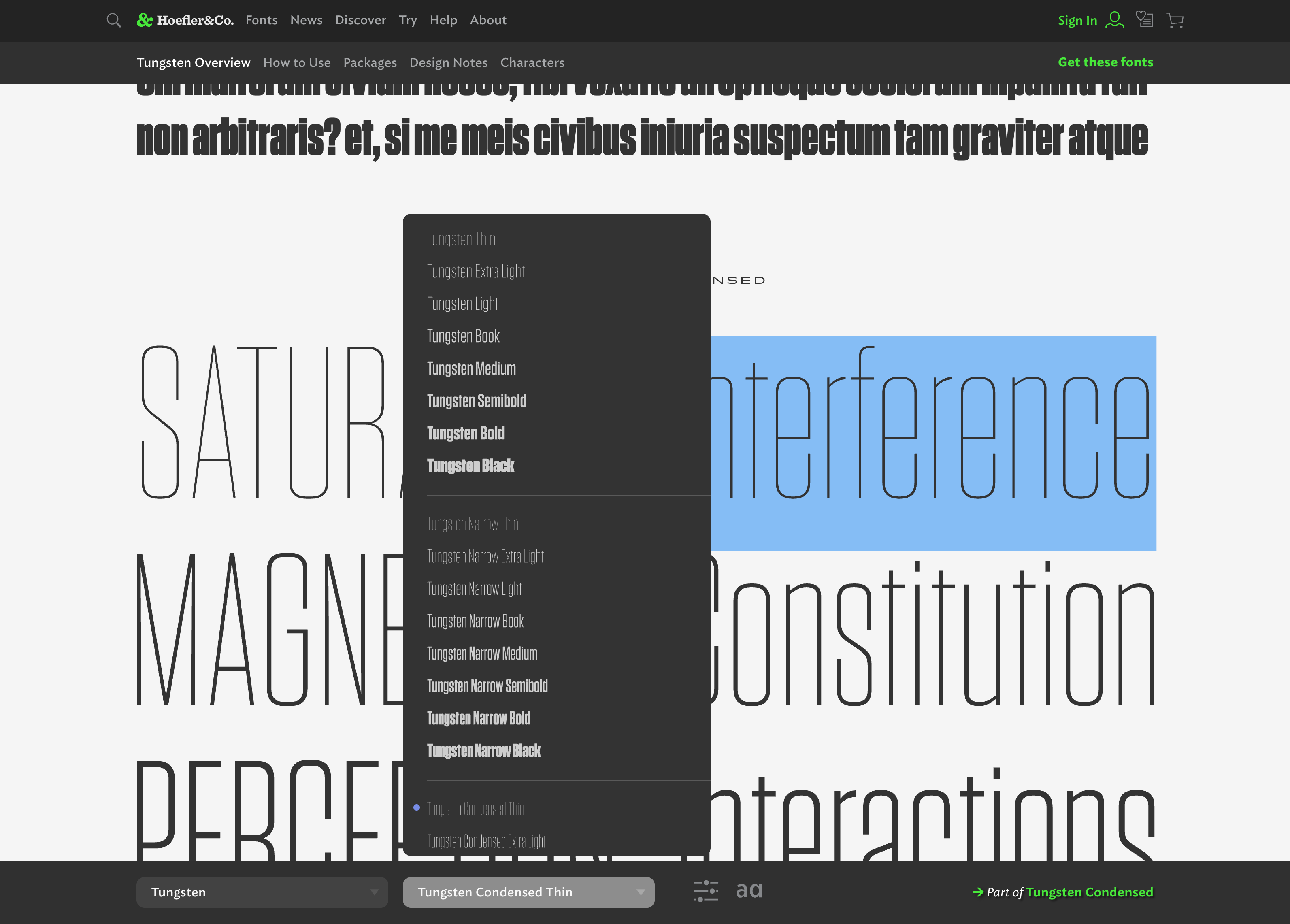
In the UI refresh, we also added a link to the appropriate font package, which changes based on the style and features used in the specimen. This way, users who experiment with the fonts — especially features and Stylistic Sets — would seamlessly be directed to the correct product on the Packages page. This added functionality removes any questions and friction in the customer’s buying journey, as well as reduces the chance of them mistakenly purchasing anything other than exactly what they need.
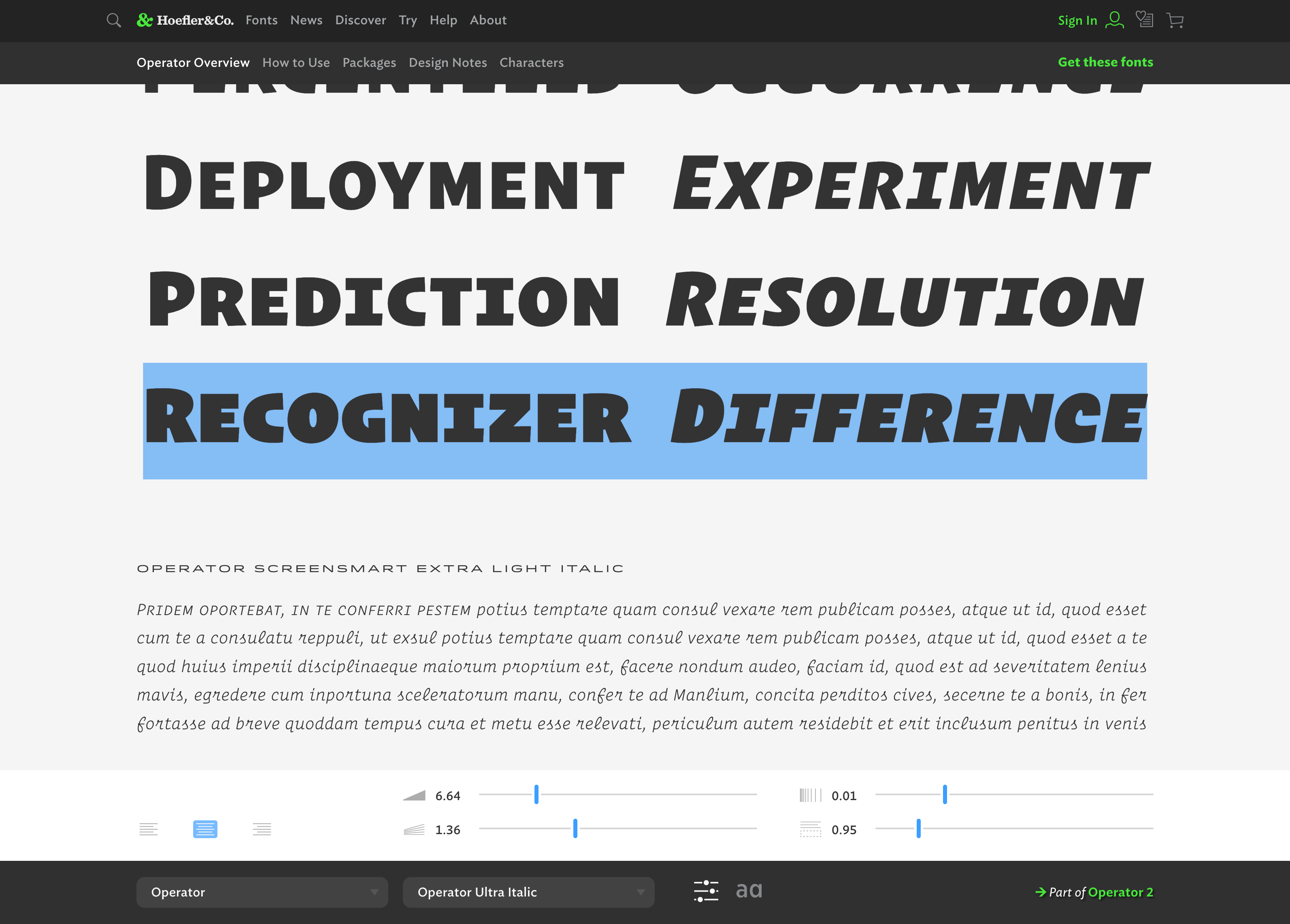
Scaling for the Overview specimens turned out so nice and felt so natural that, shortly after the new typography.com was launched, we re-redesigned the site grid to match. Again I worked with our dev team to rebuild the How To Use section to take advantage of the extra screen real estate, remastered the blog artwork to allow for display at infinitely-large sizes, and adjusted the alignment of every section, page, and element on typography.com to break out of the constraints of its fixed grid design, giving way to a site that delivers a wall of type everywhere you go.
