H&Co Advertising
A selection of my favorites.

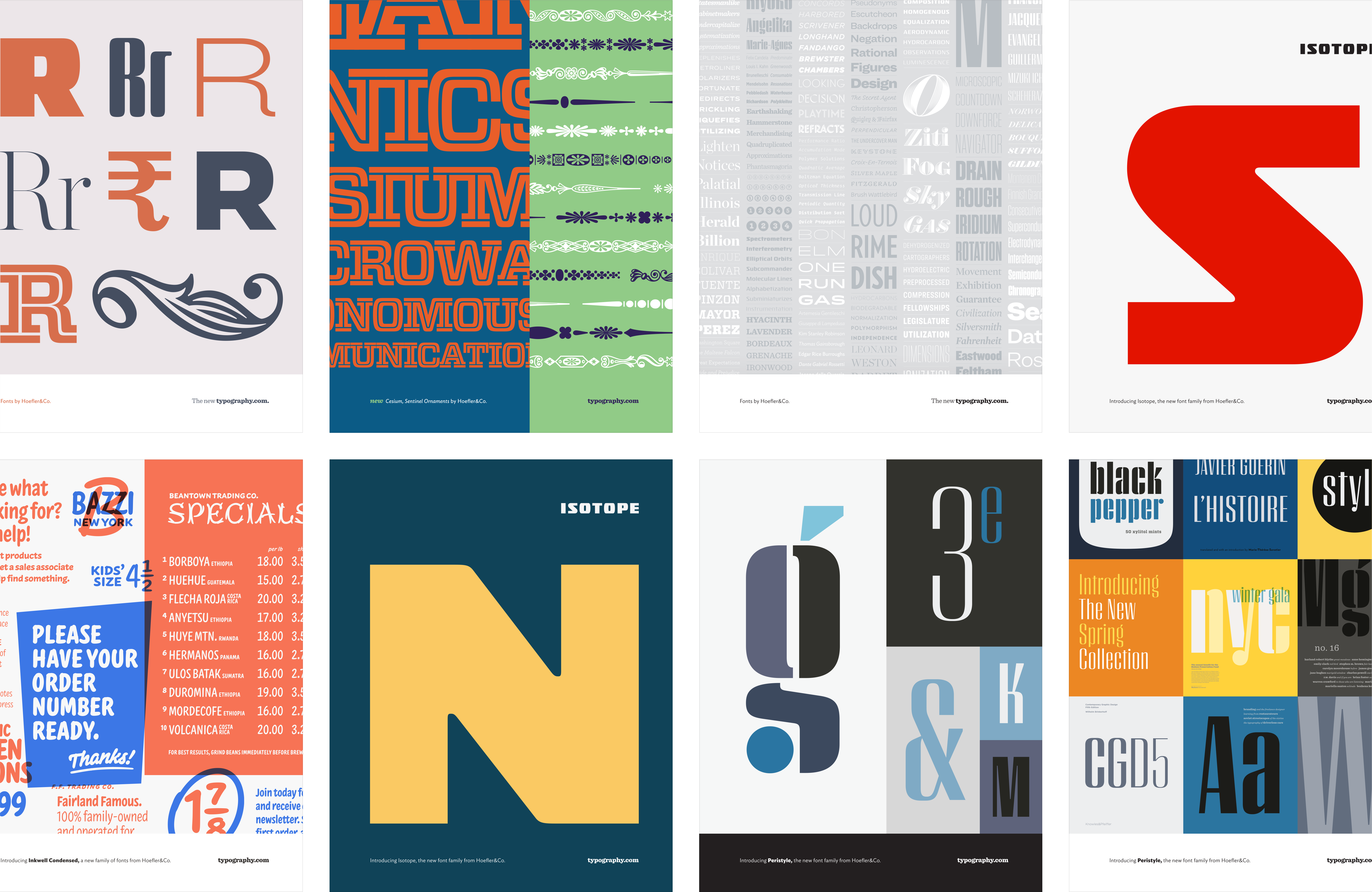
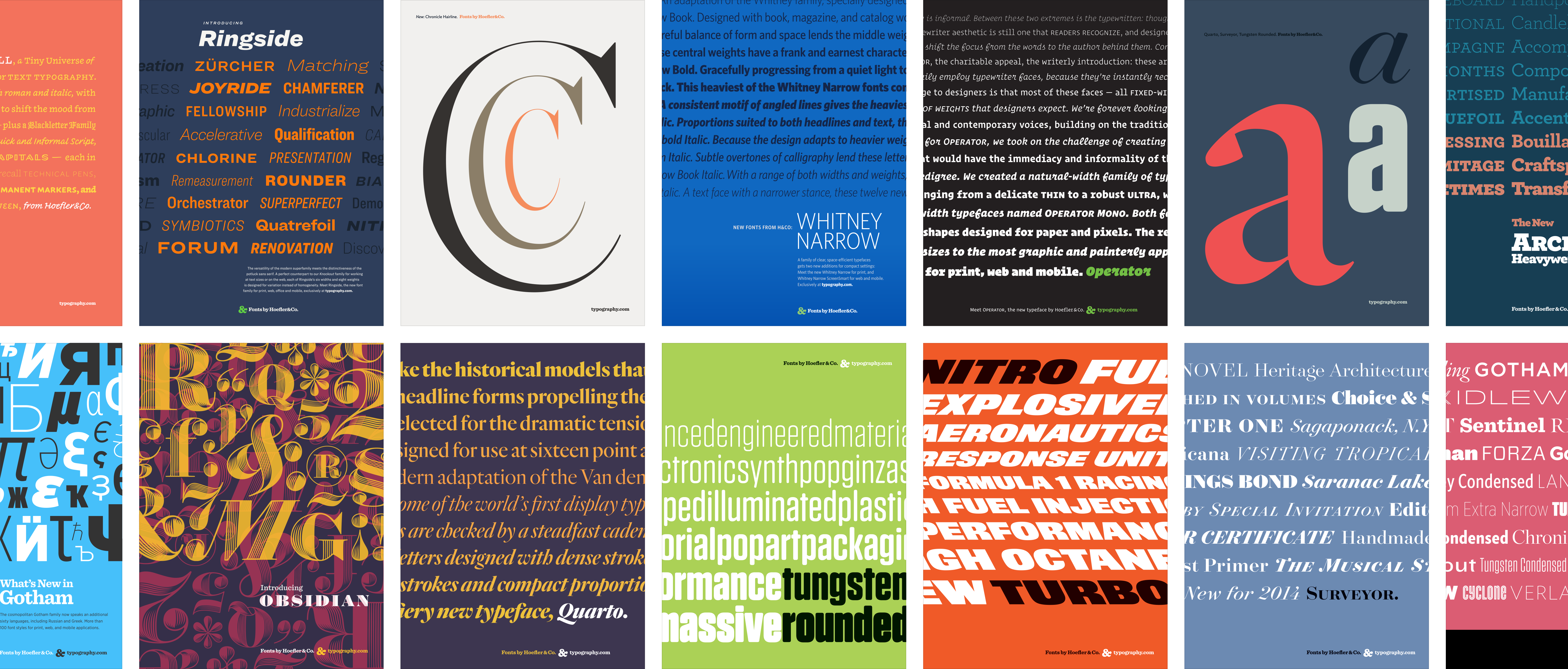
You’ll find a lot of variety in my H&Co advertising work over the years, from patchwork designs of inspirational imagery based on the slideshow artwork to classic waterfall specimens demonstrating the range of the font family to poster-esque designs featuring a single, signature character of the typeface. Throughout, I always used bright, exciting colors to catch the reader’s eye. And always, above everything else, I made each ad’s focus clear: it’s about the type.

We ran ads for brand awareness. Ads that announced every font release and expansion, as well as those that highlighted featured fonts. I also helped design ads for new offerings and services like Cloud.typography, App.typography, and ScreenSmart fonts. These ads appeared in leading design industry publications such as Eye, Creative Review, Print, ID, HOW, Communication Arts, Graphic Design USA, Codex, and 8 Faces, while many more made appearances in various type and design-adjacent conference programs. If you enjoy the variety seen here, be sure to check out the H&Co emails while you’re here.
